字体
Abhartach DEMO 字体
说明
- 字体: Abhartach DEMO
- 重量: Regular
- 版本: Version Version 1.000
- 特征号: 253
- 编码体系:
- 是固定摊位: 0
欢迎来到 字体趋势 页面——在这里了解正在塑造当下设计风格的字体。 不论是品牌焕新、社媒视觉还是网站界面,追踪趋势都能让作品保持新鲜与相关性。
本合集展示本季最 流行 的字体,来自全球设计师与创作者的真实选择。 你会看到优雅的衬线、极简的无衬线、个性十足的展示体与手作感脚本体,它们共同定义 2025 的审美。
将心仪的趋势字体与 Modern、Serif、Handwritten 等经典类别搭配,打造平衡而吸睛的排版。
-
( Fonts by Roger White - www.rogersfonts.org.uk )
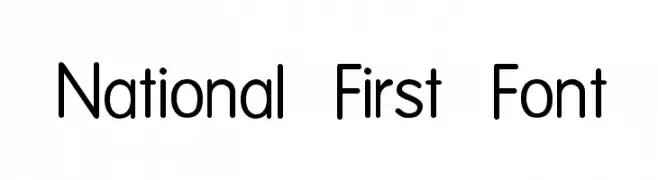
A modern, rounded sans-serif font with uniform stroke width and excellent readability.
 下载 3323 下载@WebFont
 -
( Fonts by Jacob Fisher - www.pizzadude.dk )
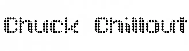
A dot matrix style font with a modern, tech-inspired aesthetic.
![Chuck Chillout 免费字体下载]() 下载 723 下载@WebFont
下载 723 下载@WebFont -
![VTC PizzOff Regular 免费字体下载]() 下载 247 下载@WebFont
下载 247 下载@WebFont -
( Fonts by or from www.graffitifonts.net )
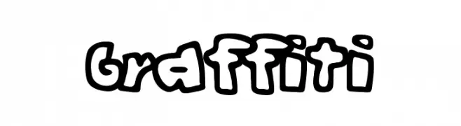
A bold, playful graffiti-style font with thick, rounded characters.
![Graffiti 免费字体下载]() 下载 2359 下载@WebFont
下载 2359 下载@WebFont -
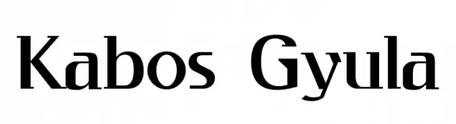
( Fonts by Levi Halmos )
A modern serif font with sharp angles and strong vertical emphasis.
![Kabos Gyula 免费字体下载]() 下载 874 下载@WebFont
下载 874 下载@WebFont -
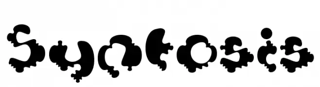
![Syntosis 免费字体下载]() 下载 149 下载@WebFont
下载 149 下载@WebFont -
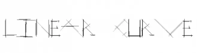
( Fonts by Typography in Decay )
A geometric, linear font with intersecting lines and boxed numerals.
![Linear Curve 免费字体下载]() 下载 471 下载@WebFont
下载 471 下载@WebFont -
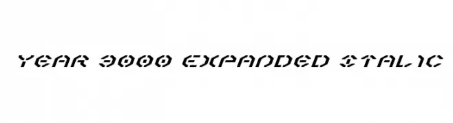
( Fonts by Daniel Zadorozny - www.iconian.com - Free for personal use )
A bold, expanded, and italic futuristic font with geometric and angular design.
![Year 3000 Expanded Italic 免费字体下载]() 下载 145 下载@WebFont
下载 145 下载@WebFont
常见问题 — 字体趋势
当前的字体趋势是什么?
关键词是简洁、易读与温度:圆润的无衬线、高对比度的衬线,以及优雅的复古回潮——既干净又有人情味。
现在流行哪些具体字体?
像 National First Font, Chuck Chillout, VTC PizzOff Regular, Graffiti and Kabos Gyula 这样兼顾现代与经典气质的字体很受欢迎。 在网页、社媒与包装上都能呈现出清爽而富表现力的观感。
如何在项目中使用趋势字体?
标题使用有辨识度的展示体,正文搭配简单的无衬线,以获得对比同时确保可读性。 在不同屏幕与载体上都要做测试,再最终定稿。
💡 小贴士:每隔几个月替换一次 趋势字体,既能保持视觉新鲜,也有利于内容被发现(SEO)。