字体
Aeroplus Personal Use 字体
说明
- 字体: Aeroplus Personal Use
- 重量: Regular
- 版本: Version Version 1.002;Fontself Maker 3.5.8
- 特征号: 184
- 编码体系:
- 是固定摊位: 0
欢迎来到 字体趋势 页面——在这里了解正在塑造当下设计风格的字体。 不论是品牌焕新、社媒视觉还是网站界面,追踪趋势都能让作品保持新鲜与相关性。
本合集展示本季最 流行 的字体,来自全球设计师与创作者的真实选择。 你会看到优雅的衬线、极简的无衬线、个性十足的展示体与手作感脚本体,它们共同定义 2025 的审美。
将心仪的趋势字体与 Modern、Serif、Handwritten 等经典类别搭配,打造平衡而吸睛的排版。
-
( Font by Berry Brooks - Fontocide )
A bold, distressed font with a grunge and rebellious style.
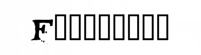 下载 567 下载@WebFont
 -
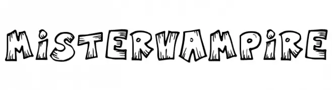
![MisterVampire 免费字体下载]() 下载 475 下载@WebFont
下载 475 下载@WebFont -
( Fonts by Cathy Davies - cathydavies.com )
A playful, hand-drawn font with exaggerated curves and sharp angles.
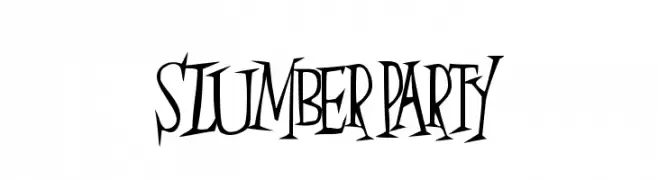
![SlumberParty 免费字体下载]() 下载 327 下载@WebFont
下载 327 下载@WebFont -
( Fonts by Rodrigo German - RASDESIGN )
A bold, block-like font with a vintage athletic feel.
![78SKATE 免费字体下载]() 下载 1564 下载@WebFont
下载 1564 下载@WebFont -
( Fonts by Rodrigo German - RASDESIGN )
A bold, outlined font with geometric structure and modern appeal.
![78 skate outline 免费字体下载]() 下载 7274 下载@WebFont
下载 7274 下载@WebFont -
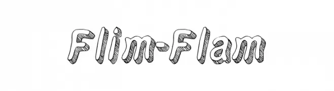
( Fonts by Thomas Ledin - tomledin.com )
A playful, 3D hand-drawn font with bold, rounded characters and sketch-like texture.
![Flim-Flam 免费字体下载]() 下载 1421 下载@WebFont
下载 1421 下载@WebFont -
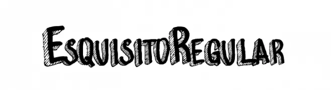
![EsquisitoRegular 免费字体下载]() 下载 712 下载@WebFont
下载 712 下载@WebFont -
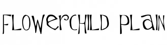
( Fonts by Marty Bee - www.martybee.com )
A whimsical, hand-drawn style font with playful, irregular letterforms.
![Flowerchild Plain 免费字体下载]() 下载 595 下载@WebFont
下载 595 下载@WebFont


常见问题 — 字体趋势
当前的字体趋势是什么?
关键词是简洁、易读与温度:圆润的无衬线、高对比度的衬线,以及优雅的复古回潮——既干净又有人情味。
现在流行哪些具体字体?
像 Fontocide, MisterVampire, SlumberParty, 78SKATE and 78 skate outline 这样兼顾现代与经典气质的字体很受欢迎。 在网页、社媒与包装上都能呈现出清爽而富表现力的观感。
如何在项目中使用趋势字体?
标题使用有辨识度的展示体,正文搭配简单的无衬线,以获得对比同时确保可读性。 在不同屏幕与载体上都要做测试,再最终定稿。
💡 小贴士:每隔几个月替换一次 趋势字体,既能保持视觉新鲜,也有利于内容被发现(SEO)。