字体
Christmas Building 字体
说明
- 字体: Christmas Building
- 重量: Regular
- 版本: Version 1.002;Fontself Maker 3.5.8
- 特征号: 191
- 编码体系:
- 是固定摊位: 0
欢迎来到 字体趋势 页面——在这里了解正在塑造当下设计风格的字体。 不论是品牌焕新、社媒视觉还是网站界面,追踪趋势都能让作品保持新鲜与相关性。
本合集展示本季最 流行 的字体,来自全球设计师与创作者的真实选择。 你会看到优雅的衬线、极简的无衬线、个性十足的展示体与手作感脚本体,它们共同定义 2025 的审美。
将心仪的趋势字体与 Modern、Serif、Handwritten 等经典类别搭配,打造平衡而吸睛的排版。
-
( Fonts by Lecter Johnson - doubletwostudios.tumblr.com )
A bold, distressed font with a gritty, urban aesthetic.
 下载 3450 下载@WebFont
 -
( Free for personal use - Fonts by Markus Schroppel. For commercial license please donate to http://www.die-gute-schrift.de/donation.html )
A bold, hand-drawn font with an artistic and playful style.
![LLChina 免费字体下载]() 下载 379 下载@WebFont
下载 379 下载@WebFont -
( Fonts by www.sweeep.fr - Damien Gosset )
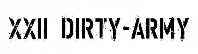
A bold, stencil-style font with sharp serifs and industrial appeal.
![Ver Army 免费字体下载]() 下载 1434 下载@WebFont
下载 1434 下载@WebFont -
( Fonts by a Clement Nicolle - www.stereo-type.fr . Personal-use only. For commercial use please contact owner. )
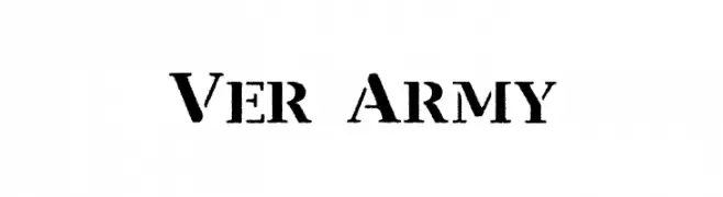
A bold, stencil-style font with a gritty, urban texture.
![Barrio 30 免费字体下载]() 下载 2024 下载@WebFont
下载 2024 下载@WebFont -
( Fonts by David Rakowski )
A bold, stencil-like font with high contrast and a modern, industrial style.
![Lintsec Medium 免费字体下载]() 下载 2336 下载
下载 2336 下载 -
( Fonts by www.typodermicfonts.com - Ray Larabie )
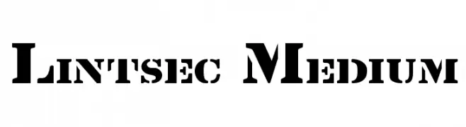
A bold, stencil-style font with a distressed, spray-painted look.
![Octin Spraypaint Free 免费字体下载]() 下载 3240 下载@WebFont
下载 3240 下载@WebFont -
![Barrel 免费字体下载]() 下载 4145 下载@WebFont
下载 4145 下载@WebFont -
( Fonts by www.typodermicfonts.com - Ray Larabie )
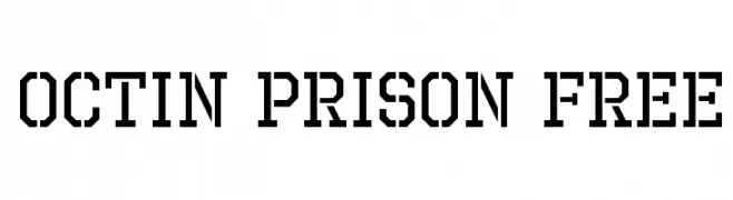
A bold, industrial font with a geometric, stencil-like design.
![Octin Prison Free 免费字体下载]() 下载 1912 下载@WebFont
下载 1912 下载@WebFont


常见问题 — 字体趋势
当前的字体趋势是什么?
关键词是简洁、易读与温度:圆润的无衬线、高对比度的衬线,以及优雅的复古回潮——既干净又有人情味。
现在流行哪些具体字体?
像 XXII DIRTY-ARMY, LLChina, Ver Army, Barrio 30 and Lintsec Medium 这样兼顾现代与经典气质的字体很受欢迎。 在网页、社媒与包装上都能呈现出清爽而富表现力的观感。
如何在项目中使用趋势字体?
标题使用有辨识度的展示体,正文搭配简单的无衬线,以获得对比同时确保可读性。 在不同屏幕与载体上都要做测试,再最终定稿。
💡 小贴士:每隔几个月替换一次 趋势字体,既能保持视觉新鲜,也有利于内容被发现(SEO)。