字体
Country 字体
说明
- 字体: Country
- 重量: Regular
- 版本: Version 1.002;Fontself Maker 3.5.7
- 特征号: 119
- 编码体系:
- 是固定摊位: 0
欢迎来到 字体趋势 页面——在这里了解正在塑造当下设计风格的字体。 不论是品牌焕新、社媒视觉还是网站界面,追踪趋势都能让作品保持新鲜与相关性。
本合集展示本季最 流行 的字体,来自全球设计师与创作者的真实选择。 你会看到优雅的衬线、极简的无衬线、个性十足的展示体与手作感脚本体,它们共同定义 2025 的审美。
将心仪的趋势字体与 Modern、Serif、Handwritten 等经典类别搭配,打造平衡而吸睛的排版。
-
( Fonts by Nick Curtis - www.nicksfonts.com )
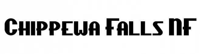
A bold, geometric font with Art Deco influences, perfect for striking headlines and branding.
 下载 1432 下载@WebFont
 -
( Fonts by http://perso.calixo.net/~uzim/ )
A bold, distressed font with a rugged, eroded appearance.
![Apocalypse 免费字体下载]() 下载 1753 下载@WebFont
下载 1753 下载@WebFont -
![Lou 免费字体下载]() 下载 3725 下载@WebFont
下载 3725 下载@WebFont -
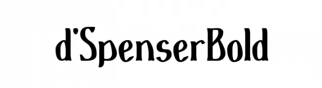
( Paul Lloyd Fonts )
A bold, dynamic font with unique curves and artistic flair.
![d'SpenserBold 免费字体下载]() 下载 256 下载
下载 256 下载 -
( Paul Lloyd Fonts )
A playful, artistic font with tall, hand-drawn characters and varying stroke widths.
![d'Spenser 免费字体下载]() 下载 299 下载
下载 299 下载 -
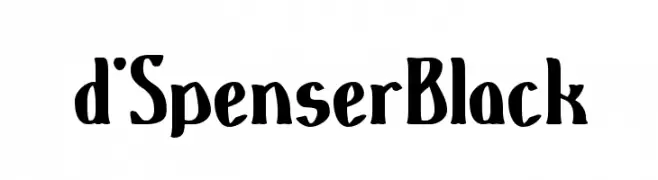
( Paul Lloyd Fonts )
A bold, hand-drawn style font with expressive, uneven strokes.
![d'SpenserBlack 免费字体下载]() 下载 207 下载
下载 207 下载 -
![Halcyonia 免费字体下载]() 下载 338 下载@WebFont
下载 338 下载@WebFont -
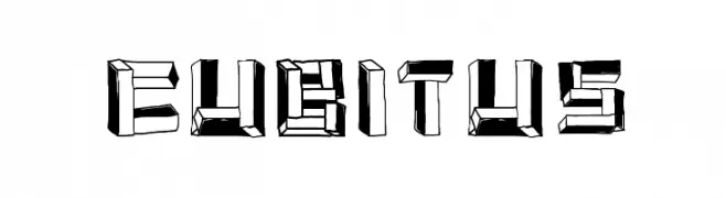
字体 通过 osmangranda. For commercial use please contact the owner.
![cubitus 免费字体下载]() 下载 1985 下载@WebFont
下载 1985 下载@WebFont


常见问题 — 字体趋势
当前的字体趋势是什么?
关键词是简洁、易读与温度:圆润的无衬线、高对比度的衬线,以及优雅的复古回潮——既干净又有人情味。
现在流行哪些具体字体?
像 Chippewa Falls NF, Apocalypse, Lou, d'SpenserBold and d'Spenser 这样兼顾现代与经典气质的字体很受欢迎。 在网页、社媒与包装上都能呈现出清爽而富表现力的观感。
如何在项目中使用趋势字体?
标题使用有辨识度的展示体,正文搭配简单的无衬线,以获得对比同时确保可读性。 在不同屏幕与载体上都要做测试,再最终定稿。
💡 小贴士:每隔几个月替换一次 趋势字体,既能保持视觉新鲜,也有利于内容被发现(SEO)。