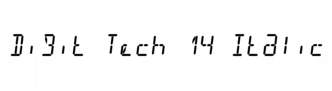
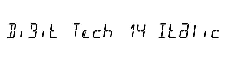
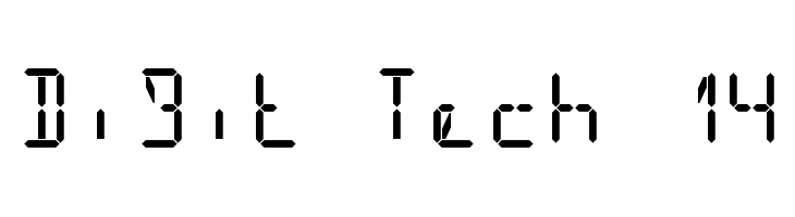
Digit Tech 14 Italic Font
✎ Futuristic
📄 TrueType
🔢 280 字符
⬇ 68
✅ 免费
✅ Web Font
Fonts by GGBot - www.ggbot.net - Personal-use only. For commercial use please contact owner.

此字体包含 280 个字符。点击任意字符查看详情。
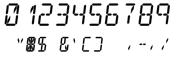
数字和符号
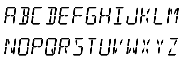
DIGIT-TECH-14-ITALIC 大写
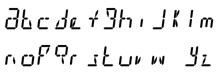
DIGIT-TECH-14-ITALIC 小写
DIGIT-TECH-14-ITALIC 其它煤焦
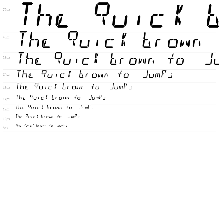
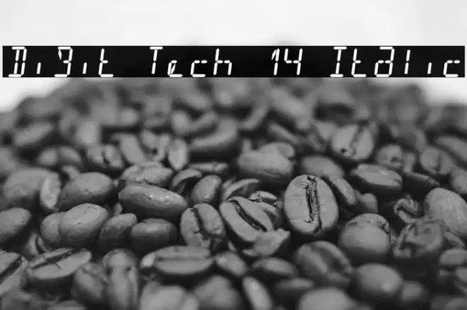
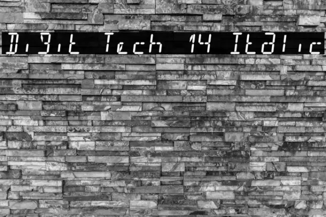
画廊示例

相似免费字体
名片

社交媒体头图

Logo
海报

信息
| 名称 | Digit Tech 14 Italic |
| 字体家族 | Digit Tech 14 |
| Style | DigitTech14-Italic |
| 格式 | TrueType (.ttf) |
| 文件 | Digit-Tech-14-Italic.zip |
| 重量 | Italic |
| 版本 | Version 1.00 |
| 特征号 | 280 |
| 下载 | 68 |
| 新增 | 2025-03-08 |
| 分类 | Futuristic |
| 粗体 | No |
| 斜体 | Yes |
| 宽度 | Normal |
| 字符间距 | Normal |
| 对比度 | Low |
| 整体风格 | Modern |
| 使用场景 | Headlines, Logos |
| 推荐项目 | Ideal for digital interfaces, tech-themed posters, video game graphics, and futuristic branding. |
| 是固定摊位 | Yes |
| Web Font | 可用 |
| 许可证 | 个人使用免费 |
Fonts by GGBot - www.ggbot.net - Personal-use only. For commercial use please contact owner.
💻 Windows
- 解压 ZIP
- 右键 .ttf -> 安装
🍎 macOS
- 解压 ZIP
- 双击 .ttf -> 安装字体
Digit Tech 14 Italic
免费 · TrueType
| 名称 | Digit Tech 14 Italic |
| 类型 | TrueType |
| 字符 | 280 |
| 下载 | 68 |
| 新增 | 2025-03-08 |
| Web Font | 可用 |
| 作者 | Fonts by GGBot - www.ggbot.net - Personal-use only. For commercial use please contact owner. |
| 分类 | Futuristic |