字体
Good Slick 字体
说明
- 字体: Good Slick
- 重量:
- 版本:
- 特征号:
- 编码体系:
- 是固定摊位: 0
欢迎来到 字体趋势 页面——在这里了解正在塑造当下设计风格的字体。 不论是品牌焕新、社媒视觉还是网站界面,追踪趋势都能让作品保持新鲜与相关性。
本合集展示本季最 流行 的字体,来自全球设计师与创作者的真实选择。 你会看到优雅的衬线、极简的无衬线、个性十足的展示体与手作感脚本体,它们共同定义 2025 的审美。
将心仪的趋势字体与 Modern、Serif、Handwritten 等经典类别搭配,打造平衡而吸睛的排版。
-
( Fonts by Altsys Metamorphosis )
A bold, dynamic font with sharp, angular strokes and artistic flair.
 下载 3948 下载@WebFont
 -
( Fonts by Graham Meade - GemFonts )
A modern, clean sans-serif font with uniform strokes and rounded edges.
![Goulong 免费字体下载]() 下载 2590 下载@WebFont
下载 2590 下载@WebFont -
( Fonts by David Rakowski )
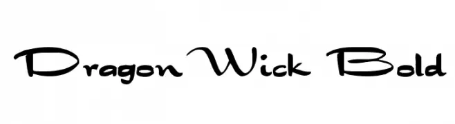
A bold, decorative font with a whimsical, cursive-like style.
![DragonWick Bold 免费字体下载]() 下载 1062 下载@WebFont
下载 1062 下载@WebFont -
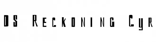
![DS Reckoning Cyr 免费字体下载]() 下载 319 下载@WebFont
下载 319 下载@WebFont -
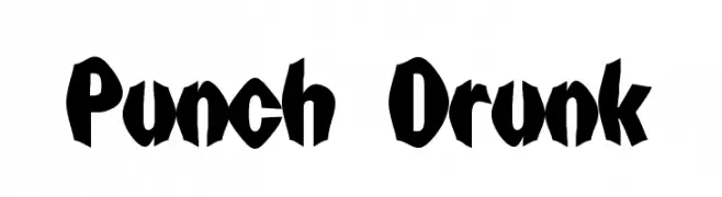
( Fonts by Digital Graphics Labs - www.digitalgraphiclabs.com )
A bold, playful font with exaggerated, uneven strokes and a hand-drawn feel.
![Punch Drunk 免费字体下载]() 下载 371 下载@WebFont
下载 371 下载@WebFont -
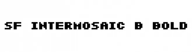
( Fonts by ShyFonts )
A bold, pixelated font with a retro digital aesthetic.
![SF Intermosaic B Bold 免费字体下载]() 下载 185 下载@WebFont
下载 185 下载@WebFont -
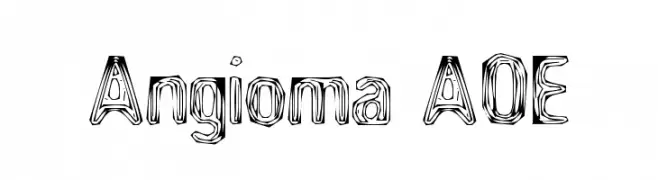
( Fonts by Astigmatic One Eye Typographic Institute - Brian J. Bonislawsky - astigmatic.com )
A bold, artistic font with a hand-drawn, layered appearance.
![Angioma AOE 免费字体下载]() 下载 505 下载@WebFont
下载 505 下载@WebFont -
( Fonts by www.freakyfonts.de )
Cartoon and pixel art character font inspired by classic video games.
![Taito All Stars 免费字体下载]() 下载 488 下载@WebFont
下载 488 下载@WebFont


常见问题 — 字体趋势
当前的字体趋势是什么?
关键词是简洁、易读与温度:圆润的无衬线、高对比度的衬线,以及优雅的复古回潮——既干净又有人情味。
现在流行哪些具体字体?
像 Bonzai Regular, Goulong, DragonWick Bold, DS Reckoning Cyr and Punch Drunk 这样兼顾现代与经典气质的字体很受欢迎。 在网页、社媒与包装上都能呈现出清爽而富表现力的观感。
如何在项目中使用趋势字体?
标题使用有辨识度的展示体,正文搭配简单的无衬线,以获得对比同时确保可读性。 在不同屏幕与载体上都要做测试,再最终定稿。
💡 小贴士:每隔几个月替换一次 趋势字体,既能保持视觉新鲜,也有利于内容被发现(SEO)。