字体
KR Katlings Two 字体
说明
- KR Katlings Two.ttf
- 字体: KR Katlings Two
- 重量: Regular
- 版本: Version Macromedia Fontographer 4.1 1/28/02
- 特征号: 56
- 编码体系:
- 是固定摊位: 0
欢迎来到 字体趋势 页面——在这里了解正在塑造当下设计风格的字体。 不论是品牌焕新、社媒视觉还是网站界面,追踪趋势都能让作品保持新鲜与相关性。
本合集展示本季最 流行 的字体,来自全球设计师与创作者的真实选择。 你会看到优雅的衬线、极简的无衬线、个性十足的展示体与手作感脚本体,它们共同定义 2025 的审美。
将心仪的趋势字体与 Modern、Serif、Handwritten 等经典类别搭配,打造平衡而吸睛的排版。
-
( Paul Lloyd Fonts )
A bold, inline font with a dramatic and elegant style.
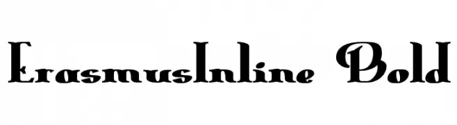 下载 205 下载
 -
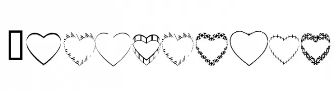
( Fonts by www.4yeo.com )
A playful, heart-themed decorative font with bold rectangular numerals and symbols.
![4YEOhearts 免费字体下载]() 下载 1940 下载@WebFont
下载 1940 下载@WebFont -
( Fonts by www.4yeo.com )
A Halloween-themed decorative font with letters in coffin shapes and skeletons.
![4YEOhalloween 免费字体下载]() 下载 1143 下载@WebFont
下载 1143 下载@WebFont -
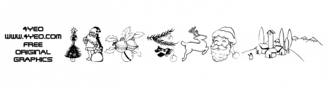
( Fonts by www.4yeo.com )
Hand-drawn holiday-themed decorative illustrations.
![4YEOXMAS 免费字体下载]() 下载 10690 下载@WebFont
下载 10690 下载@WebFont -
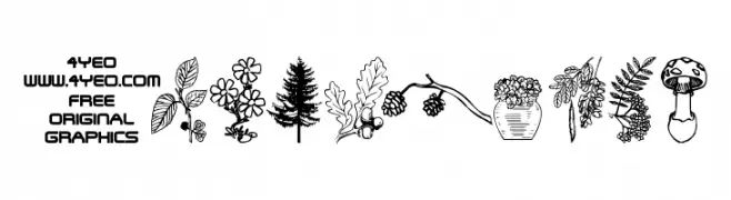
( Fonts by www.4yeo.com )
A bold, geometric display font with garden and nature illustrations.
![4YEOgarden 免费字体下载]() 下载 4312 下载@WebFont
下载 4312 下载@WebFont -
( Fonts by www.4yeo.com )
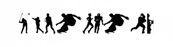
Silhouette-based display font featuring sports figures.
![4YEOSPORT 免费字体下载]() 下载 6441 下载@WebFont
下载 6441 下载@WebFont -
( Fonts by www.4yeo.com )
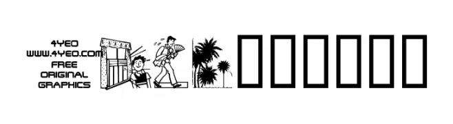
Decorative dingbat font with summer and vacation illustrations.
![4YEOsummer 免费字体下载]() 下载 1704 下载@WebFont
下载 1704 下载@WebFont -
( Fonts by www.4yeo.com )
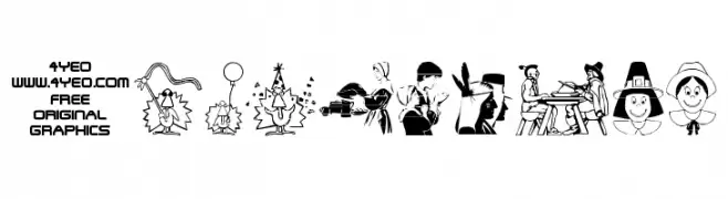
Thanksgiving-themed dingbat font with festive illustrations.
![4YEOTHANKS 免费字体下载]() 下载 909 下载@WebFont
下载 909 下载@WebFont

常见问题 — 字体趋势
当前的字体趋势是什么?
关键词是简洁、易读与温度:圆润的无衬线、高对比度的衬线,以及优雅的复古回潮——既干净又有人情味。
现在流行哪些具体字体?
像 ErasmusInline Bold, 4YEOhearts, 4YEOhalloween, 4YEOXMAS and 4YEOgarden 这样兼顾现代与经典气质的字体很受欢迎。 在网页、社媒与包装上都能呈现出清爽而富表现力的观感。
如何在项目中使用趋势字体?
标题使用有辨识度的展示体,正文搭配简单的无衬线,以获得对比同时确保可读性。 在不同屏幕与载体上都要做测试,再最终定稿。
💡 小贴士:每隔几个月替换一次 趋势字体,既能保持视觉新鲜,也有利于内容被发现(SEO)。