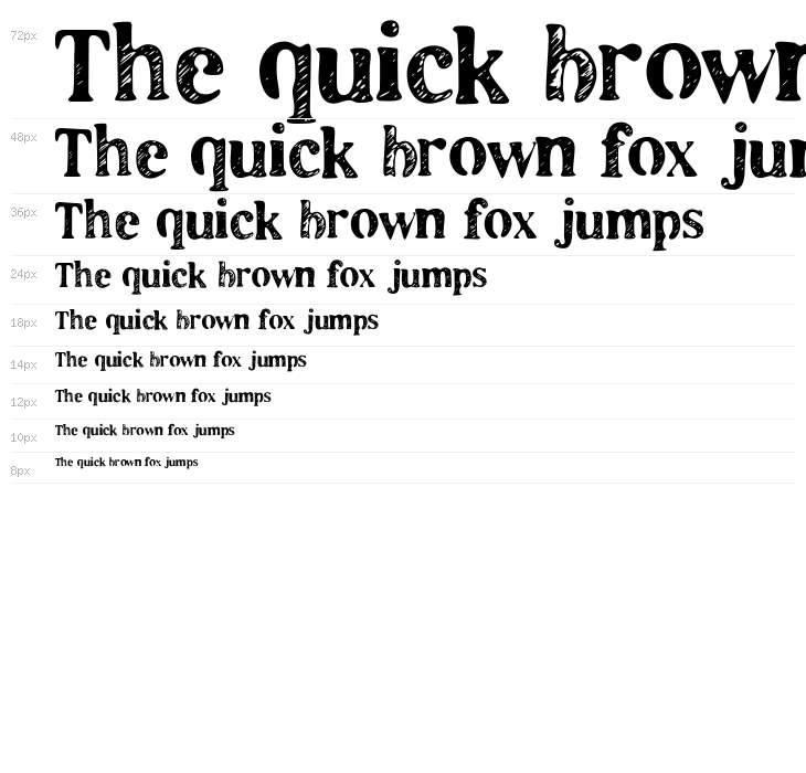
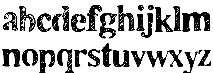
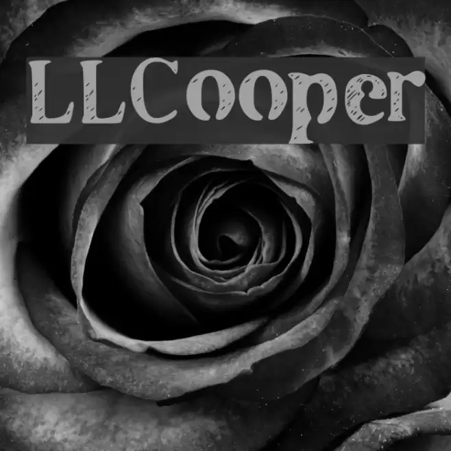
LLCooper Font
✎ Stencil
📄 PostScript
🔢 183 字符
⬇ 909
✅ 免费
✅ Web Font

<font color=red>Free for personal use</font> - Fonts by Markus Schroppel. For commercial license please donate to http://www.die-gute-schrift.de/donation.html

此字体包含 183 个字符。点击任意字符查看详情。
数字和符号
LLCOOPER 大写

LLCOOPER 小写
LLCOOPER 其它煤焦

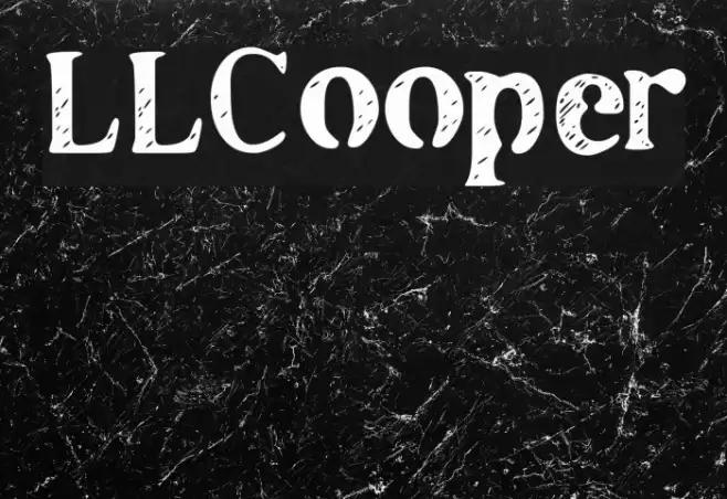
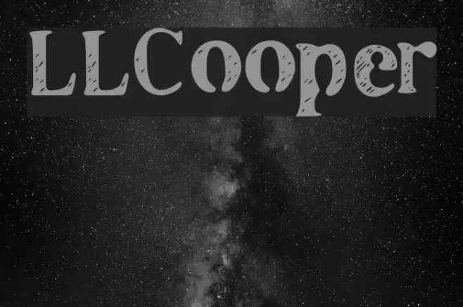
画廊示例
相似免费字体

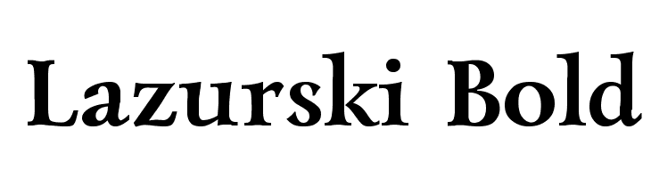
相似商业字体


名片

社交媒体头图

Logo
海报

信息
| 名称 | LLCooper |
| TTF Name | LLCOOPER.TTF |
| 字体家族 | 1 |
| Style | 1 |
| 格式 | PostScript (.ttf) |
| 文件 | LLCooper.zip |
| 重量 | Regular |
| 版本 | Version Fontographer 4.7 22.10.2009 FG4M000000254 |
| 特征号 | 183 |
| 下载 | 909 |
| 新增 | 2010-03-30 |
| 更新时间 | 2024-12-05 |
| 分类 | Stencil |
| 粗体 | Yes |
| 斜体 | No |
| 宽度 | Normal |
| 字符间距 | Monospaced |
| 对比度 | Medium |
| 整体风格 | Decorative |
| 使用场景 | Headlines, Logos, Posters |
| 推荐项目 | Ideal for creative projects such as posters, album covers, branding, and packaging that aim to stand out with a distinctive and artistic touch. |
| 是固定摊位 | No |
| Web Font | 可用 |
| 许可证 | 个人使用免费 |
<font color=red>Free for personal use</font> - Fonts by Markus Schroppel. For commercial license please donate to http://www.die-gute-schrift.de/donation.html
标签
💻 Windows
- 解压 ZIP
- 右键 .ttf -> 安装
🍎 macOS
- 解压 ZIP
- 双击 .ttf -> 安装字体
LLCooper
免费 · PostScript
| 名称 | LLCooper |
| 类型 | PostScript |
| 字符 | 183 |
| 下载 | 909 |
| 新增 | 2010-03-30 |
| Web Font | 可用 |
| 作者 | <font color=red>Free for personal use</font> - Fonts by Markus Schroppel. For commercial license please donate to http://www.die-gute-schrift.de/donation.html |
| 分类 | Stencil |