Opeln2001 Szeroki Font
✎ Thick
📄 TrueType
🔢 269 字符
⬇ 3,081
✅ 免费
✅ Web Font

Fonts by Bartek Nowak - www.nowak.tv/fontoholic/

此字体包含 269 个字符。点击任意字符查看详情。
数字和符号
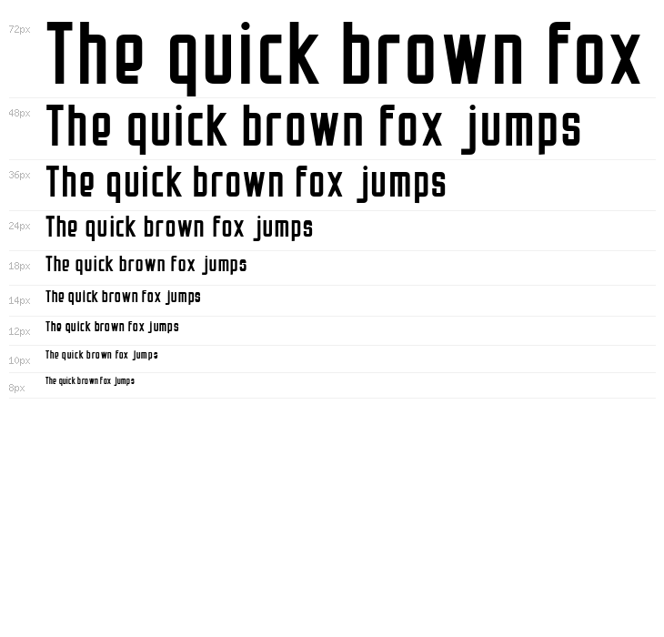
OPELN2001-SZEROKI 大写
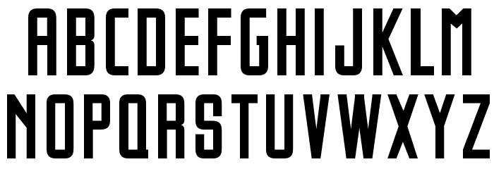
OPELN2001-SZEROKI 小写
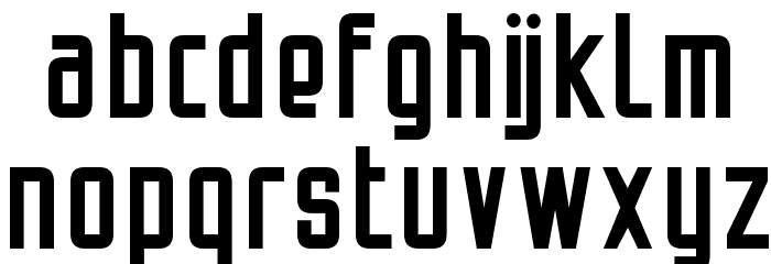
OPELN2001-SZEROKI 其它煤焦
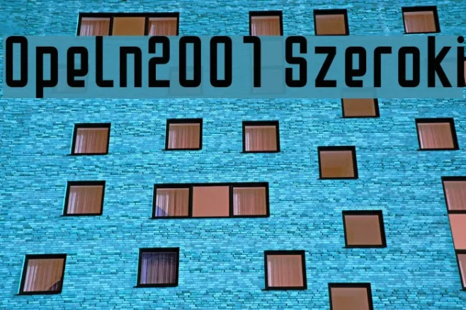
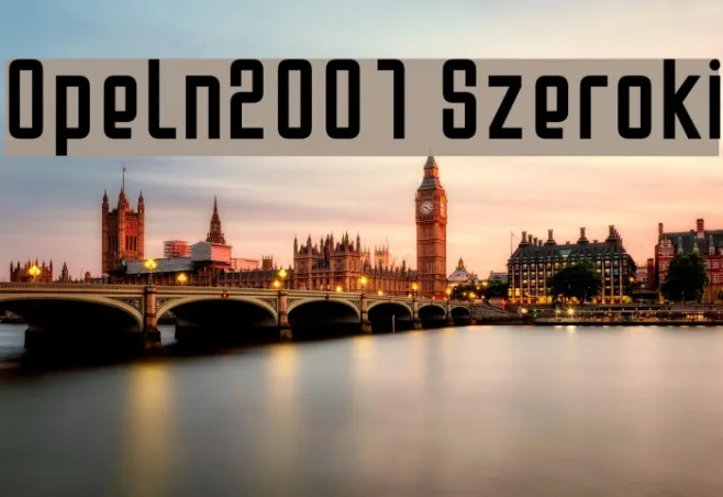
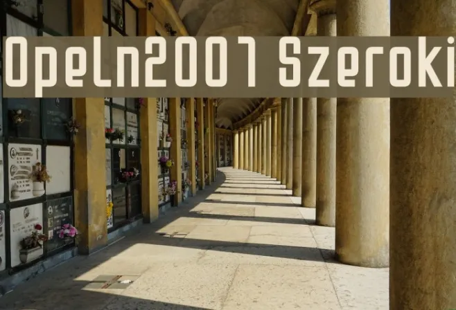
画廊示例
相似免费字体


相似商业字体


名片

社交媒体头图

Logo
海报

信息
| 名称 | Opeln2001 Szeroki |
| TTF Name | Opeln2001 Szeroki.ttf |
| 字体家族 | 1 |
| Style | 1 |
| 格式 | TrueType (.ttf) |
| 文件 | Opeln2001-Szeroki.zip |
| 重量 | Regular |
| 版本 | Version Version 1.... |
| 特征号 | 269 |
| 下载 | 3,081 |
| 新增 | 2010-03-31 |
| 更新时间 | 2024-12-05 |
| 分类 | Thick |
| 粗体 | Yes |
| 斜体 | No |
| 宽度 | Condensed |
| 字符间距 | Monospaced |
| 对比度 | Low |
| 整体风格 | Modern |
| 使用场景 | Headlines, Logos, Posters |
| 推荐项目 | Ideal for branding, headlines, posters, and digital interfaces where a strong, modern presence is desired. |
| 是固定摊位 | No |
| Web Font | 可用 |
| 许可证 | 个人使用免费 |
Fonts by Bartek Nowak - www.nowak.tv/fontoholic/
标签
💻 Windows
- 解压 ZIP
- 右键 .ttf -> 安装
🍎 macOS
- 解压 ZIP
- 双击 .ttf -> 安装字体
Opeln2001 Szeroki
免费 · TrueType
| 名称 | Opeln2001 Szeroki |
| 类型 | TrueType |
| 字符 | 269 |
| 下载 | 3,081 |
| 新增 | 2010-03-31 |
| Web Font | 可用 |
| 作者 | Fonts by Bartek Nowak - www.nowak.tv/fontoholic/ |
| 分类 | Thick |