字体
Partita Personal Used 字体
说明
- 字体: Partita Personal Used
- 重量:
- 版本:
- 特征号:
- 编码体系:
- 是固定摊位: 0
欢迎来到 字体趋势 页面——在这里了解正在塑造当下设计风格的字体。 不论是品牌焕新、社媒视觉还是网站界面,追踪趋势都能让作品保持新鲜与相关性。
本合集展示本季最 流行 的字体,来自全球设计师与创作者的真实选择。 你会看到优雅的衬线、极简的无衬线、个性十足的展示体与手作感脚本体,它们共同定义 2025 的审美。
将心仪的趋势字体与 Modern、Serif、Handwritten 等经典类别搭配,打造平衡而吸睛的排版。
-
( Fonts by Daniel Zadorozny - www.iconian.com - Free for personal use )
A rugged, distressed font with a bold and dynamic style.
 下载 225 下载@WebFont
 -
( Fonts by Marty Bee - www.martybee.com )
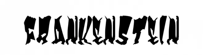
A bold, jagged font with a classic horror theme and hand-drawn appearance.
![Frankenstein 免费字体下载]() 下载 6508 下载@WebFont
下载 6508 下载@WebFont -
![Sinister-Plot 免费字体下载]() 下载 477 下载@WebFont
下载 477 下载@WebFont -
( Fonts by Daniel Zadorozny - www.iconian.com - Free for personal use )
A rugged, distressed font with a bold, grunge-inspired aesthetic.
![Tussle 免费字体下载]() 下载 254 下载@WebFont
下载 254 下载@WebFont -
( Fonts by Apostrophic Lab )
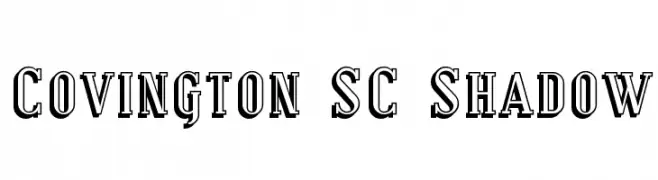
A bold serif font with a distinctive shadow effect, blending classic and modern styles.
![Covington SC Shadow 免费字体下载]() 下载 281 下载@WebFont
下载 281 下载@WebFont -
( Fonts by Apostrophic Lab )
A classic serif font with elegant, elongated strokes and pronounced serifs.
![Covington SC 免费字体下载]() 下载 670 下载@WebFont
下载 670 下载@WebFont -
( Fonts by Apostrophic Lab )
A bold, condensed font with a strong, elegant presence.
![Covington SC Cond Bold 免费字体下载]() 下载 499 下载@WebFont
下载 499 下载@WebFont -
( Fonts by Apostrophic Lab )
A bold, italicized serif font with strong, dynamic strokes.
![Covington SC Bold Italic 免费字体下载]() 下载 159 下载@WebFont
下载 159 下载@WebFont


常见问题 — 字体趋势
当前的字体趋势是什么?
关键词是简洁、易读与温度:圆润的无衬线、高对比度的衬线,以及优雅的复古回潮——既干净又有人情味。
现在流行哪些具体字体?
像 Tussle Expanded, Frankenstein, Sinister-Plot, Tussle and Covington SC Shadow 这样兼顾现代与经典气质的字体很受欢迎。 在网页、社媒与包装上都能呈现出清爽而富表现力的观感。
如何在项目中使用趋势字体?
标题使用有辨识度的展示体,正文搭配简单的无衬线,以获得对比同时确保可读性。 在不同屏幕与载体上都要做测试,再最终定稿。
💡 小贴士:每隔几个月替换一次 趋势字体,既能保持视觉新鲜,也有利于内容被发现(SEO)。