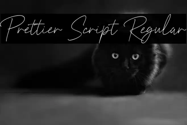
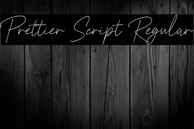
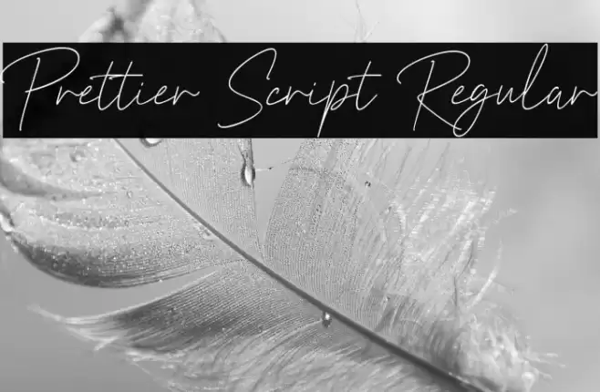
Prettier Script Regular Font
✎ Handwritten
📄 TrueType
🔢 291 字符
⬇ 2,389
✅ 免费
✅ Web Font

Fonts by 50Fox Studio - www.50fox.com - Personal-use only. For commercial use please contact owner.
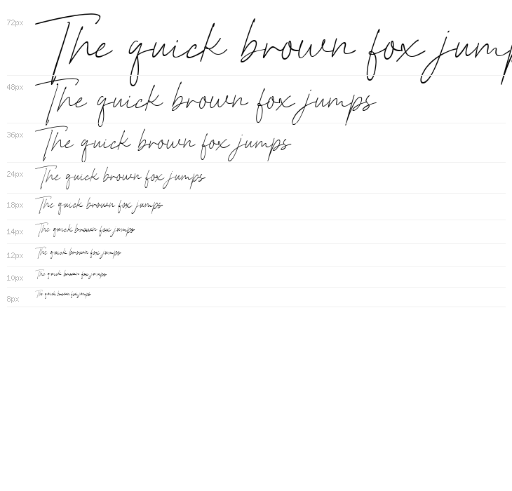

此字体包含 291 个字符。点击任意字符查看详情。
数字和符号
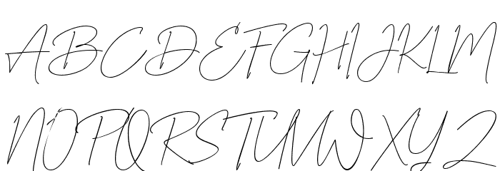
PRETTIER-SCRIPT-REGULAR 大写
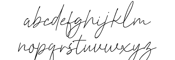
PRETTIER-SCRIPT-REGULAR 小写
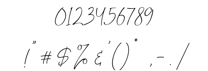
PRETTIER-SCRIPT-REGULAR 其它煤焦
画廊示例
暂无相似字体数据。
名片

社交媒体头图

Logo
海报

信息
| 名称 | Prettier Script Regular |
| 字体家族 | Prettier Script |
| Style | PrettierScript-Regular |
| 格式 | TrueType (.ttf) |
| 文件 | Prettier-Script-Regular.zip |
| 重量 | Regular |
| 版本 | Version Version 1.000 |
| 特征号 | 291 |
| 下载 | 2,389 |
| 新增 | 2024-07-10 |
| 更新时间 | 2024-11-21 |
| 分类 | Handwritten |
| 粗体 | No |
| 斜体 | Yes |
| 宽度 | Normal |
| 字符间距 | Monospaced |
| 对比度 | Low |
| 整体风格 | Elegant |
| 使用场景 | Logos, Invitations, Personal Correspondence |
| 推荐项目 | Ideal for wedding invitations, greeting cards, personal branding, and elegant packaging designs. |
| 是固定摊位 | No |
| Web Font | 可用 |
| 许可证 | 个人使用免费 |
Fonts by 50Fox Studio - www.50fox.com - Personal-use only. For commercial use please contact owner.
标签
💻 Windows
- 解压 ZIP
- 右键 .ttf -> 安装
🍎 macOS
- 解压 ZIP
- 双击 .ttf -> 安装字体
Prettier Script Regular
免费 · TrueType
| 名称 | Prettier Script Regular |
| 类型 | TrueType |
| 字符 | 291 |
| 下载 | 2,389 |
| 新增 | 2024-07-10 |
| Web Font | 可用 |
| 作者 | Fonts by 50Fox Studio - www.50fox.com - Personal-use only. For commercial use please contact owner. |
| 分类 | Handwritten |