字体
Rattman 字体
说明
- Rattman.ttf
- 字体: Rattman
- 重量: Regular
- 版本: Version Version 1.00;June 15, 2020;FontCreator 11.5.0.2430 64-bit
- 特征号: 118
- 编码体系:
- 是固定摊位: 0
欢迎来到 字体趋势 页面——在这里了解正在塑造当下设计风格的字体。 不论是品牌焕新、社媒视觉还是网站界面,追踪趋势都能让作品保持新鲜与相关性。
本合集展示本季最 流行 的字体,来自全球设计师与创作者的真实选择。 你会看到优雅的衬线、极简的无衬线、个性十足的展示体与手作感脚本体,它们共同定义 2025 的审美。
将心仪的趋势字体与 Modern、Serif、Handwritten 等经典类别搭配,打造平衡而吸睛的排版。
-
( Fonts by Matthew Austin Petty - www.disturbed.com )
A bold, distressed font with a vintage, textured style.
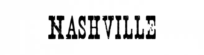 下载 7634 下载@WebFont
 -
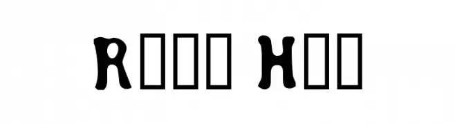
( Font by Berry Brooks - Fontocide )
A bold, playful font with exaggerated curves and a whimsical style.
![Road Hoe 免费字体下载]() 下载 278 下载@WebFont
下载 278 下载@WebFont -
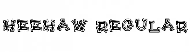
( Fonts by Rick Mueller )
A playful, bold font with a unique outlined, hand-drawn style.
![HeeHaw Regular 免费字体下载]() 下载 659 下载@WebFont
下载 659 下载@WebFont -
( Fonts by www.imbran.net - Bran )
A bold, decorative font with a vintage Western style.
![nu 免费字体下载]() 下载 5140 下载@WebFont
下载 5140 下载@WebFont -
( Fonts by Antrax - ja-fonts.iweb.pl )
A bold, high-contrast font with geometric and modern elements.
![cherif 免费字体下载]() 下载 1040 下载@WebFont
下载 1040 下载@WebFont -
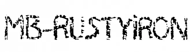
![MB-RustyIron 免费字体下载]() 下载 234 下载@WebFont
下载 234 下载@WebFont -
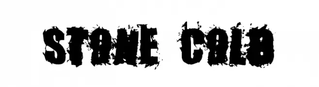
( Fonts by Rob Dobi - Toxic Type - www.dobi.nu )
A bold, distressed font with a rugged, stone-like appearance.
![Stone Cold 免费字体下载]() 下载 802 下载@WebFont
下载 802 下载@WebFont -
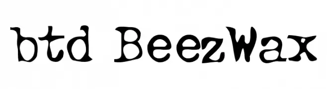
![btd BeezWax 免费字体下载]() 下载 426 下载@WebFont
下载 426 下载@WebFont


常见问题 — 字体趋势
当前的字体趋势是什么?
关键词是简洁、易读与温度:圆润的无衬线、高对比度的衬线,以及优雅的复古回潮——既干净又有人情味。
现在流行哪些具体字体?
像 Nashville, Road Hoe, HeeHaw Regular, nu and cherif 这样兼顾现代与经典气质的字体很受欢迎。 在网页、社媒与包装上都能呈现出清爽而富表现力的观感。
如何在项目中使用趋势字体?
标题使用有辨识度的展示体,正文搭配简单的无衬线,以获得对比同时确保可读性。 在不同屏幕与载体上都要做测试,再最终定稿。
💡 小贴士:每隔几个月替换一次 趋势字体,既能保持视觉新鲜,也有利于内容被发现(SEO)。