字体
Sugar Donut Line 字体
说明
- 字体: Sugar Donut Line
- 重量: Regular
- 版本: Version Version 1.00;January 7, 2021;FontCreator 11.5.0.2430 64-bit
- 特征号: 200
- 编码体系:
- 是固定摊位: 0
欢迎来到 字体趋势 页面——在这里了解正在塑造当下设计风格的字体。 不论是品牌焕新、社媒视觉还是网站界面,追踪趋势都能让作品保持新鲜与相关性。
本合集展示本季最 流行 的字体,来自全球设计师与创作者的真实选择。 你会看到优雅的衬线、极简的无衬线、个性十足的展示体与手作感脚本体,它们共同定义 2025 的审美。
将心仪的趋势字体与 Modern、Serif、Handwritten 等经典类别搭配,打造平衡而吸睛的排版。
-
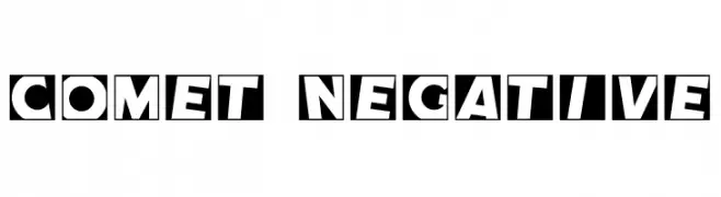
( Fonts by Harold Lohner - www.haroldsfonts.com )
A bold, playful font with high contrast and unique negative space design.
 下载 1947 下载@WebFont
 -
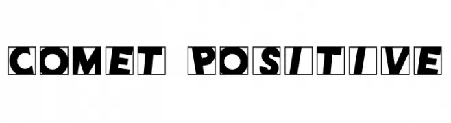
( Fonts by Harold Lohner - www.haroldsfonts.com )
A bold, playful font with high contrast and dynamic, tilted characters enclosed in squares.
![Comet Positive 免费字体下载]() 下载 327 下载@WebFont
下载 327 下载@WebFont -
![101! StaR StuDDeD 免费字体下载]() 下载 3191 下载@WebFont
下载 3191 下载@WebFont -
![Scratchy 免费字体下载]() 下载 536 下载@WebFont
下载 536 下载@WebFont -
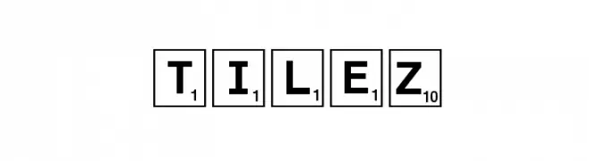
( Fonts by ARRF Designs )
A bold, uppercase font styled like board game tiles with numbers.
![Tilez 免费字体下载]() 下载 394 下载@WebFont
下载 394 下载@WebFont -
( Fonts by Dieter Schumacher )
A bold, decorative font with a mosaic-like pattern, ideal for striking visual designs.
![Dar Skin 免费字体下载]() 下载 535 下载@WebFont
下载 535 下载@WebFont -
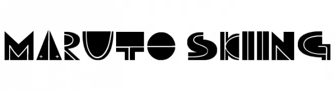
![Maruto Skiing 免费字体下载]() 下载 240 下载@WebFont
下载 240 下载@WebFont -
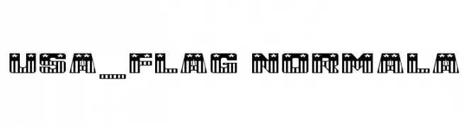
![USA_Flag NormalA 免费字体下载]() 下载 169 下载@WebFont
下载 169 下载@WebFont


常见问题 — 字体趋势
当前的字体趋势是什么?
关键词是简洁、易读与温度:圆润的无衬线、高对比度的衬线,以及优雅的复古回潮——既干净又有人情味。
现在流行哪些具体字体?
像 Comet Negative, Comet Positive, 101! StaR StuDDeD, Scratchy and Tilez 这样兼顾现代与经典气质的字体很受欢迎。 在网页、社媒与包装上都能呈现出清爽而富表现力的观感。
如何在项目中使用趋势字体?
标题使用有辨识度的展示体,正文搭配简单的无衬线,以获得对比同时确保可读性。 在不同屏幕与载体上都要做测试,再最终定稿。
💡 小贴士:每隔几个月替换一次 趋势字体,既能保持视觉新鲜,也有利于内容被发现(SEO)。