字体
WordSignature 字体
说明
- 字体: WordSignature
- 重量: Regular
- 版本: Version Version 001.000
- 特征号: 98
- 编码体系:
- 是固定摊位: 0
欢迎来到 字体趋势 页面——在这里了解正在塑造当下设计风格的字体。 不论是品牌焕新、社媒视觉还是网站界面,追踪趋势都能让作品保持新鲜与相关性。
本合集展示本季最 流行 的字体,来自全球设计师与创作者的真实选择。 你会看到优雅的衬线、极简的无衬线、个性十足的展示体与手作感脚本体,它们共同定义 2025 的审美。
将心仪的趋势字体与 Modern、Serif、Handwritten 等经典类别搭配,打造平衡而吸睛的排版。
-
( Fonts by Manfred Klein - manfred-klein.ina-mar.com )
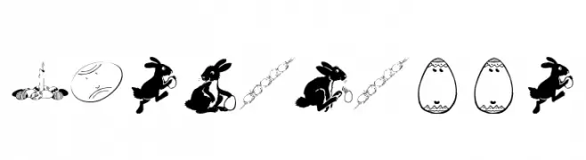
Decorative dingbat font with Easter-themed illustrations.
 下载 710 下载@WebFont
 -
![wmeaster1 免费字体下载]() 下载 355 下载@WebFont
下载 355 下载@WebFont -
( Fonts by Kat`s Fun Fonts - Personal-use only. For commercial use please contact owner. )
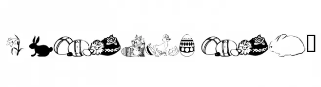
A decorative Easter-themed font with playful illustrations in each character.
![KR Easter No 2 免费字体下载]() 下载 238 下载@WebFont
下载 238 下载@WebFont -
( Fonts by Apostrophic Lab )
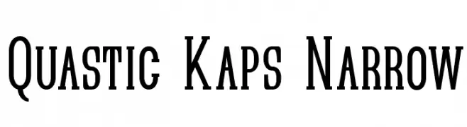
A narrow, elongated serif font with strong vertical emphasis and sharp serifs.
![Quastic Kaps Narrow 免费字体下载]() 下载 356 下载@WebFont
下载 356 下载@WebFont -
( Fonts by Apostrophic Lab )
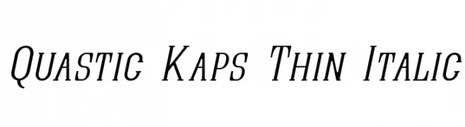
A thin, italicized font with elegant, elongated characters and moderate contrast.
![Quastic Kaps Thin Italic 免费字体下载]() 下载 135 下载@WebFont
下载 135 下载@WebFont -
( Fonts by Apostrophic Lab )
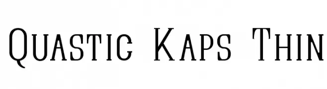
A modern, elegant font with thin, elongated strokes and slight serifs.
![Quastic Kaps Thin 免费字体下载]() 下载 194 下载@WebFont
下载 194 下载@WebFont -
( Fonts by Apostrophic Lab )
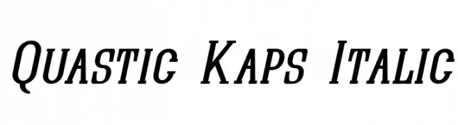
A bold, italic serif font with a modern, dynamic style.
![Quastic Kaps Italic 免费字体下载]() 下载 164 下载@WebFont
下载 164 下载@WebFont -
( Fonts by Apostrophic Lab )
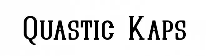
A bold, structured serif font with a modern twist, ideal for impactful designs.
![Quastic Kaps 免费字体下载]() 下载 244 下载@WebFont
下载 244 下载@WebFont
常见问题 — 字体趋势
当前的字体趋势是什么?
关键词是简洁、易读与温度:圆润的无衬线、高对比度的衬线,以及优雅的复古回潮——既干净又有人情味。
现在流行哪些具体字体?
像 Eastereggs, wmeaster1, KR Easter No 2, Quastic Kaps Narrow and Quastic Kaps Thin Italic 这样兼顾现代与经典气质的字体很受欢迎。 在网页、社媒与包装上都能呈现出清爽而富表现力的观感。
如何在项目中使用趋势字体?
标题使用有辨识度的展示体,正文搭配简单的无衬线,以获得对比同时确保可读性。 在不同屏幕与载体上都要做测试,再最终定稿。
💡 小贴士:每隔几个月替换一次 趋势字体,既能保持视觉新鲜,也有利于内容被发现(SEO)。