欢迎来到 热门字体 专区——在这里,人气与品质兼具。 这些是今年社区下载量最高、使用最广的字体。 如果你想快速选到不踩雷的字体(Logo、网页、社媒皆宜),从这里开始。
每款 热门字体 都在平衡性、可读性与通用性方面表现出色。 你会看到现代无衬线、优雅手写体、复古衬线以及极简展示体等。
-
( Fonts by Vladimir Nikolic - www.creativefabrica.com/designer/vladimirnikolic/ - Personal-use only. For commercial use please contact owner. )
A bold, geometric outline font with a modern and futuristic aesthetic.
 下载 65 下载@WebFont
 -
( Fonts by Craft Supply Co - Personal-use only. For commercial use please contact owner. )
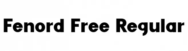
A bold, modern sans-serif font with clean lines and balanced spacing.
![Fenord Free Regular 免费字体下载]() 下载 65 下载@WebFont
下载 65 下载@WebFont -
( Fonts by Creatype Studio - Rian Rahardi - Personal-use only. For commercial use please contact owner. )
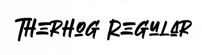
A bold, dynamic script font with a lively and flowing style.
![Therhog Regular 免费字体下载]() 下载 65 下载@WebFont
下载 65 下载@WebFont -
( Fonts by Lettersiro Studio - Muhammad Sirojuddin - Personal-use only. For commercial use please contact owner. )
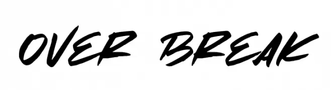
A bold, energetic script font with a modern, handwritten style.
![Over Break 免费字体下载]() 下载 65 下载@WebFont
下载 65 下载@WebFont -
( Andrew Lander - formerly at home.earthlink.net/~landerfam/fonts.html )
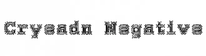
A decorative font with a bold, outlined, three-dimensional appearance.
![Cryeadn Negative 免费字体下载]() 下载 65 下载@WebFont
下载 65 下载@WebFont -
-
( Fonts by Zain Mustafa - Personal-use only. For commercial use please contact owner. )
A modern, thin, and minimalist font with clean lines and a sleek appearance.
![Mehrajan-Thin 免费字体下载]() 下载 65 下载@WebFont
下载 65 下载@WebFont -
( Fonts by Lettersiro Studio - Muhammad Sirojuddin - Personal-use only. For commercial use please contact owner. )
A clean, modern font with tall, narrow characters and consistent stroke width.
![Today Easter 免费字体下载]() 下载 65 下载@WebFont
下载 65 下载@WebFont -
( Iconian Fonts - Daniel Zadorozny - www.iconian.com )
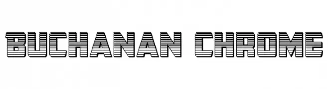
A bold, geometric font with a retro-futuristic, three-dimensional effect.
![Buchanan Chrome 免费字体下载]() 下载 65 下载@WebFont
下载 65 下载@WebFont -
( London's Letters - www.londonsletters.com/ )
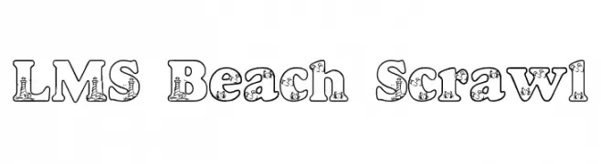
A playful, beach-themed decorative font with intricate interior designs.
![LMS Beach Scrawl 免费字体下载]() 下载 65 下载@WebFont
下载 65 下载@WebFont -
( Fonts by Vladimir Nikolic )
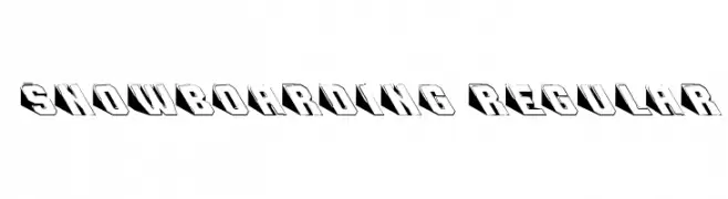
A bold, 3D font with a shadow effect, perfect for impactful designs.
![Snowboarding Regular 免费字体下载]() 下载 65 下载@WebFont
下载 65 下载@WebFont

当前最热门的字体有哪些?
设计师偏爱 Forehead Outline Regular, Fenord Free Regular, Therhog Regular, Over Break and Cryeadn Negative,因为其造型干净、适用范围广—— 从品牌识别到落地页、海报都能胜任。
Logo 最常用哪些字体?
几何 无衬线(如 Poppins、Gotham 风格家族)常用于打造简洁、可扩展的品牌。 想要更亲和,可以考虑 手写体 与手写风格。 用有力量的标题字体搭配中性的正文字体,能兼顾识别度与平衡感。
热门列表多久更新一次?
我们会根据实时下载与互动数据定期刷新。 记得常来看看,抢先发现下一波“爆款”。
💡 小贴士:把本页加入书签——趋势变化很快,今天的热门 可能会启发明天的品牌升级。