欢迎来到 热门字体 专区——在这里,人气与品质兼具。 这些是今年社区下载量最高、使用最广的字体。 如果你想快速选到不踩雷的字体(Logo、网页、社媒皆宜),从这里开始。
每款 热门字体 都在平衡性、可读性与通用性方面表现出色。 你会看到现代无衬线、优雅手写体、复古衬线以及极简展示体等。
-
( Fonts by Manuel Ramos - www.infinitismo.com - Personal-use only. For commercial use please contact owner. )
A sleek, modern italic font with elongated, uniform strokes and a dynamic appearance.
 下载 64 下载@WebFont
 -
( Flö Rastbichler - www.elopedthought.com )
A modern, light, and italic slab serif font with elegant and fluid characteristics.
![KorneuburgSlabLight-LightItalic 免费字体下载]() 下载 64 下载@WebFont
下载 64 下载@WebFont -
( Fonts by Rich Gast - www.greywolfwebworks.com OFF SITE )
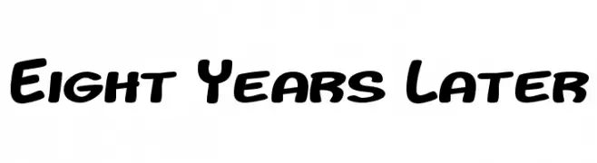
A bold, rounded font with a playful and friendly style.
![Eight Years Later 免费字体下载]() 下载 64 下载
下载 64 下载 -
( Fonts by Fonts by Alex Slobzheninov & Chris M. Simpson / Changes by Cristiano Sobral - Personal-use only. For commercial use please contact owner. )
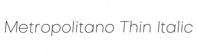
A sleek, thin, and italicized modern font with clean, consistent strokes.
![Metropolitano Thin Italic 免费字体下载]() 下载 64 下载@WebFont
下载 64 下载@WebFont -
( Fonts by Kat`s Fun Fonts - Personal-use only. For commercial use please contact owner. )
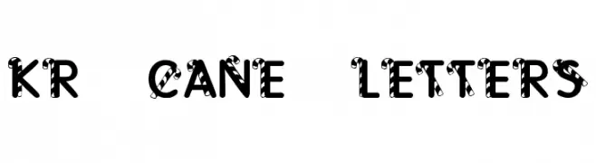
A decorative font with a candy cane striped pattern, perfect for festive designs.
![KR Cane Letters 免费字体下载]() 下载 64 下载@WebFont
下载 64 下载@WebFont -
-
( Fonts by Kat`s Fun Fonts - Personal-use only. For commercial use please contact owner. )
A decorative font with intricate floral illustrations replacing standard characters.
![KR Classic Fleur 2 免费字体下载]() 下载 64 下载@WebFont
下载 64 下载@WebFont -
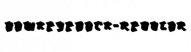
( Typodermic Fonts - Ray Larabie - www.typodermicfonts.com/ )
A bold, geometric font with a three-dimensional, graffiti-inspired style.
![HawkeyeBack-Regular 免费字体下载]() 下载 64 下载@WebFont
下载 64 下载@WebFont -
( Fonts by Peter Wiegel - www.peter-wiegel.de - Personal-use only. For commercial use please contact owner. )
A sleek, modern italic font with high contrast and elegant design.
![Yiggivoo Unicode Italic 免费字体下载]() 下载 64 下载@WebFont
下载 64 下载@WebFont -
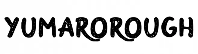
( Fonts by monocotype - Personal-use only. For commercial use please contact owner. )
A playful, textured font with a hand-drawn, casual style.
![YumaroRough 免费字体下载]() 下载 64 下载@WebFont
下载 64 下载@WebFont -
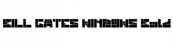
( weknow - Wino S Kadir - www.creativefabrica.com/designer/weknow/ )
A bold, geometric font with a futuristic and digital aesthetic.
![BILL GATES WINDOWS Bold 免费字体下载]() 下载 64 下载@WebFont
下载 64 下载@WebFont


当前最热门的字体有哪些?
设计师偏爱 Exacta Medium Italic, KorneuburgSlabLight-LightItalic, Eight Years Later, Metropolitano Thin Italic and KR Cane Letters,因为其造型干净、适用范围广—— 从品牌识别到落地页、海报都能胜任。
Logo 最常用哪些字体?
几何 无衬线(如 Poppins、Gotham 风格家族)常用于打造简洁、可扩展的品牌。 想要更亲和,可以考虑 手写体 与手写风格。 用有力量的标题字体搭配中性的正文字体,能兼顾识别度与平衡感。
热门列表多久更新一次?
我们会根据实时下载与互动数据定期刷新。 记得常来看看,抢先发现下一波“爆款”。
💡 小贴士:把本页加入书签——趋势变化很快,今天的热门 可能会启发明天的品牌升级。