欢迎来到 热门字体 专区——在这里,人气与品质兼具。 这些是今年社区下载量最高、使用最广的字体。 如果你想快速选到不踩雷的字体(Logo、网页、社媒皆宜),从这里开始。
每款 热门字体 都在平衡性、可读性与通用性方面表现出色。 你会看到现代无衬线、优雅手写体、复古衬线以及极简展示体等。
-
( Fonts by Vladimir Nikolic - https://www.creativefabrica.com/product/educated-deers/ref/144265/ - Personal-use only. For commercial use please contact owner. )
A bold, geometric font with high contrast and unique negative space design.
 下载 65 下载@WebFont
 -
( Fonts by a Neale Davidson - www.pixelsagas.com. Personal-use only. For commercial use please contact owner. )
A bold, angular font with a runic, italicized style.
![Kehdrai Italic 免费字体下载]() 下载 65 下载@WebFont
下载 65 下载@WebFont -
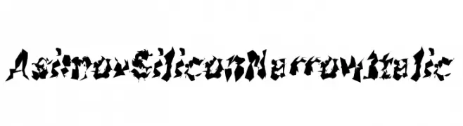
( Fonts by CannotIntoSpaceFonts - KineticPlasma Fonts - Personal-use only. For commercial use please contact owner. )
A jagged, futuristic font with sharp, angular characters and a dynamic, edgy style.
![Asimov Silicon Narrow Italic 免费字体下载]() 下载 65 下载@WebFont
下载 65 下载@WebFont -
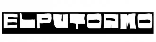
( Woodcutter - woodcutter Manero - www.woodcutter.es )
A bold, graffiti-inspired font with blocky, angular characters and a rebellious urban style.
![El puto amo 免费字体下载]() 下载 65 下载@WebFont
下载 65 下载@WebFont -
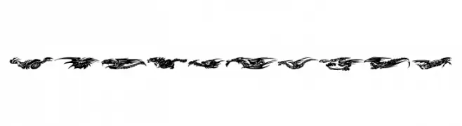
( Fonts by Zanatlija - Personal-use only. For commercial use please contact owner. )
Intricate dragon-themed decorative font with elaborate designs.
![Dragons Tfb 免费字体下载]() 下载 65 下载@WebFont
下载 65 下载@WebFont -
-
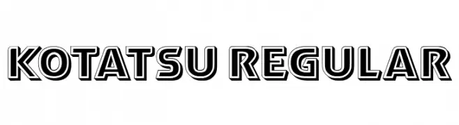
( Fonts by Vladimir Nikolic - www.creativefabrica.com/designer/vladimirnikolic/ - Personal-use only. For commercial use please contact owner. )
A bold, geometric font with a three-dimensional shadow effect.
![Kotatsu Regular 免费字体下载]() 下载 65 下载@WebFont
下载 65 下载@WebFont -
( Fonts by Wino S Kadir - weknow - www.revolge.com/shop/weknow/ - Personal-use only. For commercial use please contact owner. )
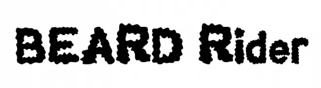
A bold, playful font with a textured, fluffy appearance.
![BEARD Rider 免费字体下载]() 下载 65 下载@WebFont
下载 65 下载@WebFont -
( Personal-use only. For commercial use please contact owner. )
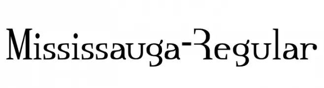
A modern serif font with angular serifs and sharp edges, offering a blend of classic and contemporary styles.
![Mississauga-Regular 免费字体下载]() 下载 65 下载@WebFont
下载 65 下载@WebFont -
( Fonts by Edric Studio - Personal-use only. For commercial use please contact owner. )
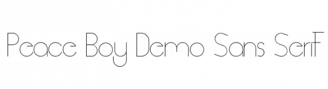
A sleek, modern sans-serif font with geometric precision and minimalist design.
![Peace Boy Demo Sans Serif 免费字体下载]() 下载 65 下载@WebFont
下载 65 下载@WebFont -
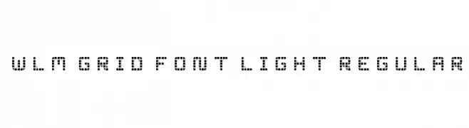
![WLM Grid Font Light Regular 免费字体下载]() 下载 65 下载@WebFont
下载 65 下载@WebFont

当前最热门的字体有哪些?
设计师偏爱 Demode Negative, Kehdrai Italic, Asimov Silicon Narrow Italic, El puto amo and Dragons Tfb,因为其造型干净、适用范围广—— 从品牌识别到落地页、海报都能胜任。
Logo 最常用哪些字体?
几何 无衬线(如 Poppins、Gotham 风格家族)常用于打造简洁、可扩展的品牌。 想要更亲和,可以考虑 手写体 与手写风格。 用有力量的标题字体搭配中性的正文字体,能兼顾识别度与平衡感。
热门列表多久更新一次?
我们会根据实时下载与互动数据定期刷新。 记得常来看看,抢先发现下一波“爆款”。
💡 小贴士:把本页加入书签——趋势变化很快,今天的热门 可能会启发明天的品牌升级。