欢迎来到 热门字体 专区——在这里,人气与品质兼具。 这些是今年社区下载量最高、使用最广的字体。 如果你想快速选到不踩雷的字体(Logo、网页、社媒皆宜),从这里开始。
每款 热门字体 都在平衡性、可读性与通用性方面表现出色。 你会看到现代无衬线、优雅手写体、复古衬线以及极简展示体等。
-
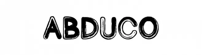
( Fonts by Font Monger - Chris Vile - Personal-use only. For commercial use please contact owner. )
A bold, playful font with a hand-drawn, distressed look.
 下载 61 下载@WebFont
 -
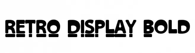
( Fonts by falahfont248 )
A bold, retro display font with rounded characters and a unique underline effect.
![RETRO DISPLAY Bold 免费字体下载]() 下载 61 下载@WebFont
下载 61 下载@WebFont -
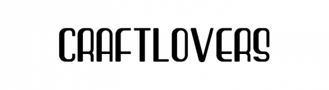
( Fonts by Burhan Afif - hanscostudio.com - Personal-use only. For commercial use please contact owner. )
A modern, geometric font with rounded edges and a clean, streamlined appearance.
![Craft Lovers 免费字体下载]() 下载 61 下载@WebFont
下载 61 下载@WebFont -
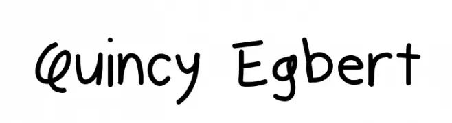
( Fonts by Geronimo Fonts - Personal-use only. For commercial use please contact owner. )
A playful, handwritten font with a casual and friendly style.
![Quincy Egbert 免费字体下载]() 下载 61 下载@WebFont
下载 61 下载@WebFont -
( Fonts by Edric Studio - Personal-use only. For commercial use please contact owner. )
An elegant script font with flowing, interconnected letters and graceful swashes.
![Juicely Demo 免费字体下载]() 下载 61 下载@WebFont
下载 61 下载@WebFont -
-
( Fonts by Kat`s Fun Fonts - Personal-use only. For commercial use please contact owner. )
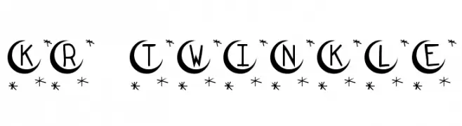
A whimsical, celestial-themed decorative font with star accents.
![KR Twinkle 免费字体下载]() 下载 61 下载@WebFont
下载 61 下载@WebFont -
( Fonts by nariswari_creative - Taufik Dwi Purnomo - Personal-use only. For commercial use please contact owner. )
A bold, textured font with diagonal hatching and rounded edges for a modern, decorative look.
![Bingke Coklat DEMO 免费字体下载]() 下载 61 下载@WebFont
下载 61 下载@WebFont -
( Chris Rigg )
A playful, casual handwritten font with a natural, organic feel.
![RIGG Font 免费字体下载]() 下载 61 下载@WebFont
下载 61 下载@WebFont -
( Noto is a trademark of Google Inc. Noto fonts are open source. All Noto fonts are published under the SIL Open Font License, Version 1.1 )
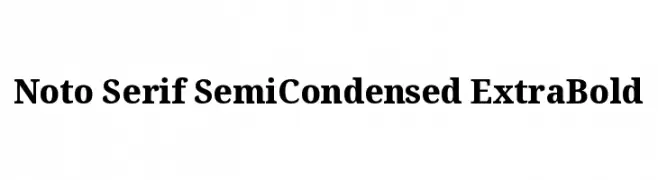
A classic serif typeface with a semi-condensed, extra bold style, perfect for impactful headlines.
![Noto Serif SemiCondensed ExtraBold 免费字体下载]() 下载 61 下载@WebFont
下载 61 下载@WebFont -
( Iconian Fonts - Daniel Zadorozny - www.iconian.com )
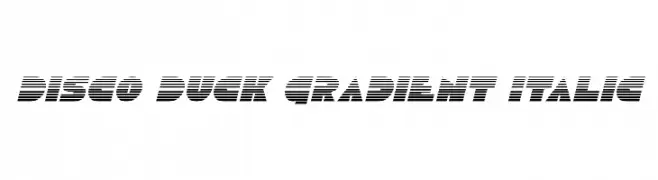
A bold, italicized font with a gradient effect created by horizontal lines.
![Disco Duck Gradient Italic 免费字体下载]() 下载 61 下载@WebFont
下载 61 下载@WebFont


当前最热门的字体有哪些?
设计师偏爱 Abduco, RETRO DISPLAY Bold, Craft Lovers, Quincy Egbert and Juicely Demo,因为其造型干净、适用范围广—— 从品牌识别到落地页、海报都能胜任。
Logo 最常用哪些字体?
几何 无衬线(如 Poppins、Gotham 风格家族)常用于打造简洁、可扩展的品牌。 想要更亲和,可以考虑 手写体 与手写风格。 用有力量的标题字体搭配中性的正文字体,能兼顾识别度与平衡感。
热门列表多久更新一次?
我们会根据实时下载与互动数据定期刷新。 记得常来看看,抢先发现下一波“爆款”。
💡 小贴士:把本页加入书签——趋势变化很快,今天的热门 可能会启发明天的品牌升级。