欢迎来到 热门字体 专区——在这里,人气与品质兼具。 这些是今年社区下载量最高、使用最广的字体。 如果你想快速选到不踩雷的字体(Logo、网页、社媒皆宜),从这里开始。
每款 热门字体 都在平衡性、可读性与通用性方面表现出色。 你会看到现代无衬线、优雅手写体、复古衬线以及极简展示体等。
-
( Fonts by Vladimir Nikolic - www.creativefabrica.com/designer/vladimirnikolic/ - Personal-use only. For commercial use please contact owner. )
A bold, geometric sans-serif font with a modern, condensed style.
 下载 54 下载@WebFont
 -
( Fonts by weknow - Wino S Kadir - Personal-use only. For commercial use please contact owner. )
A bold, rounded font with a futuristic and playful style.
![DOMINIQUE-Light 免费字体下载]() 下载 54 下载@WebFont
下载 54 下载@WebFont -
( Fonts by Tepid Monkey Fonts - Personal-use only. For commercial use please contact owner. )
A bold, pixelated font with a retro, digital aesthetic.
![Zig 免费字体下载]() 下载 54 下载@WebFont
下载 54 下载@WebFont -
( Fonts by Wino S Kadir - weknow - www.revolge.com/shop/weknow/ - Personal-use only. For commercial use please contact owner. )
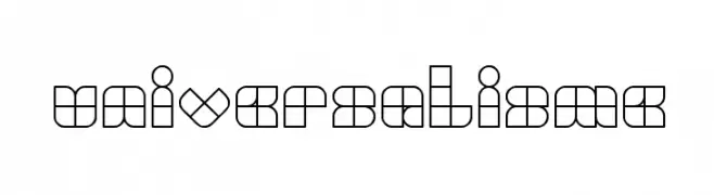
A geometric, modular font with a bold, modern aesthetic.
![UNIVERSALISME 免费字体下载]() 下载 54 下载@WebFont
下载 54 下载@WebFont -
( Ana Starhan )
A bold, geometric font with a modern, industrial style.
![HARDCOPY 免费字体下载]() 下载 54 下载@WebFont
下载 54 下载@WebFont -
-
( Fonts by Nick Curtis - Personal-use only. For commercial use please contact owner. )
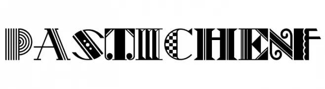
A vibrant and eclectic display font with unique decorative elements in each character.
![PasticheNF 免费字体下载]() 下载 54 下载@WebFont
下载 54 下载@WebFont -
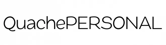
( Fonts by Mans Greback - Personal-use only. For commercial use please contact owner. )
A modern, geometric sans-serif font with uniform stroke widths and a clean appearance.
![QuachePERSONAL 免费字体下载]() 下载 54 下载@WebFont
下载 54 下载@WebFont -
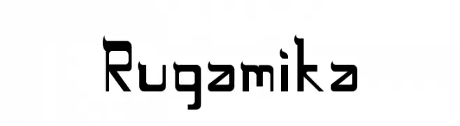
( Ananda A Ramadhani - nandadesign23.blogspot.com/ )
A bold, geometric font with a modern and slightly futuristic style.
![Rugamika 免费字体下载]() 下载 54 下载@WebFont
下载 54 下载@WebFont -
( Noto is a trademark of Google Inc. Noto fonts are open source. All Noto fonts are published under the SIL Open Font License, Version 1.1 )
A bold, modern font with a strong, assertive presence.
![Noto Sans Tamil SemiCondensed Black 免费字体下载]() 下载 54 下载@WebFont
下载 54 下载@WebFont -
( Fonts by www.chequered.ink - Chequered Ink - Personal-use only. For commercial use please contact owner. )
A bold slab serif font with strong, block-like serifs and a robust presence.
![District Four 免费字体下载]() 下载 54 下载@WebFont
下载 54 下载@WebFont


当前最热门的字体有哪些?
设计师偏爱 Shakeout Regular, DOMINIQUE-Light, Zig, UNIVERSALISME and HARDCOPY,因为其造型干净、适用范围广—— 从品牌识别到落地页、海报都能胜任。
Logo 最常用哪些字体?
几何 无衬线(如 Poppins、Gotham 风格家族)常用于打造简洁、可扩展的品牌。 想要更亲和,可以考虑 手写体 与手写风格。 用有力量的标题字体搭配中性的正文字体,能兼顾识别度与平衡感。
热门列表多久更新一次?
我们会根据实时下载与互动数据定期刷新。 记得常来看看,抢先发现下一波“爆款”。
💡 小贴士:把本页加入书签——趋势变化很快,今天的热门 可能会启发明天的品牌升级。