欢迎来到 热门字体 专区——在这里,人气与品质兼具。 这些是今年社区下载量最高、使用最广的字体。 如果你想快速选到不踩雷的字体(Logo、网页、社媒皆宜),从这里开始。
每款 热门字体 都在平衡性、可读性与通用性方面表现出色。 你会看到现代无衬线、优雅手写体、复古衬线以及极简展示体等。
-
 下载 3938 下载@WebFont
 -
( Fonts by Cadson Demak - Personal-use only. For commercial use please contact owner. )
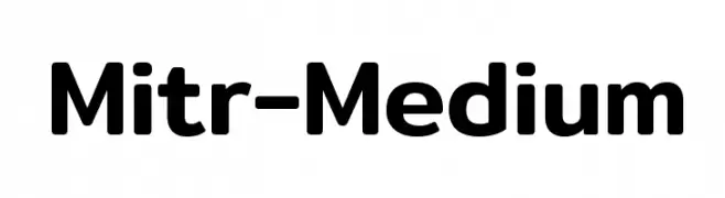
A modern, rounded sans-serif font with a clean and approachable style.
![Mitr-Medium 免费字体下载]() 下载 3937 下载@WebFont
下载 3937 下载@WebFont -
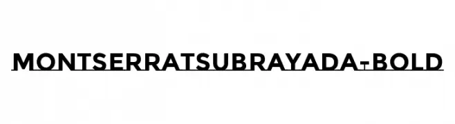
( Copyright (c) 2011-2012, Julieta Ulanovsky (julieta.ulanovsky@gmail.com), with Reserved Font Names 'Montserrat' )
A bold, modern sans-serif font with clean lines and a strong presence.
![MontserratSubrayada-Bold 免费字体下载]() 下载 3937 下载@WebFont
下载 3937 下载@WebFont -
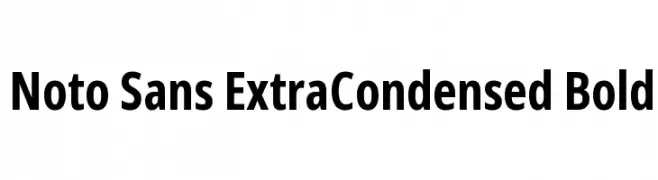
( Fonts by Google - Personal-use only. For commercial use please contact owner. )
A modern, bold, extra condensed sans-serif font with clear, uniform strokes.
![Noto Sans ExtraCondensed Bold 免费字体下载]() 下载 3936 下载@WebFont
下载 3936 下载@WebFont -
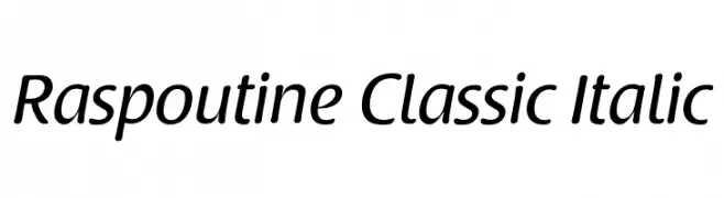
![Raspoutine Classic Italic 免费字体下载]() 下载 3936 下载@WebFont
下载 3936 下载@WebFont -
-
( Fonts by www.blambot.com )
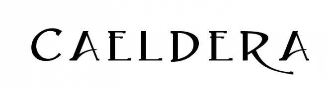
An elegant and modern serif font with decorative elements and balanced proportions.
![Caeldera 免费字体下载]() 下载 3936 下载@WebFont
下载 3936 下载@WebFont -
字体 通过 HammerBro101. For commercial use please contact the owner.
![Memphis-Bold 免费字体下载]() 下载 3935 下载@WebFont
下载 3935 下载@WebFont -
( Fonts by Sharkshock Productions----www.sharkshock.com. Personal-use only. For commercial use please contact owner. )
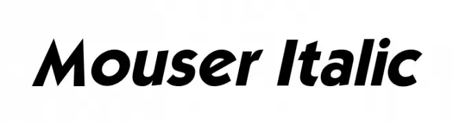
A bold, italic font with a modern and dynamic style.
![Mouser Italic 免费字体下载]() 下载 3935 下载@WebFont
下载 3935 下载@WebFont -
( Fonts by Jacob Fisher - www.pizzadude.dk )
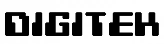
A bold, geometric font with a digital, pixel-like design.
![Digitek 免费字体下载]() 下载 3935 下载@WebFont
下载 3935 下载@WebFont -
( Fonts by Andrew McCluskey - nalgames.com. Personal-use only. For commercial use please contact owner. )
A bold, geometric font with a strong, modern industrial style.
![Piston Pressure 免费字体下载]() 下载 3934 下载@WebFont
下载 3934 下载@WebFont -
![Palatia Bold 免费字体下载]() 下载 3934 下载@WebFont
下载 3934 下载@WebFont -
![DV-TTYogesh Italic 免费字体下载]() 下载 3934 下载@WebFont
下载 3934 下载@WebFont -
( Fonts by Graham Meade - GemFonts )
A bold, italic, and modern font with rounded characters and a dynamic style.
![11S01 Black Tuesday Italic 免费字体下载]() 下载 3933 下载@WebFont
下载 3933 下载@WebFont -
( Fonts by Octotype - www.foundmyfont.com - Personal-use only. For commercial use please contact owner. )
A bold, cursive script font with dynamic, flowing strokes and decorative flair.
![Sensations and Qualities 免费字体下载]() 下载 3932 下载@WebFont
下载 3932 下载@WebFont -
( Copyright (c) 2010-2014 by tyPoland Lukasz Dziedzic (team@latofonts.com) with Reserved Font Name "Lato" )
A modern, italic sans-serif font with balanced weight and clear legibility.
![Lato SemiBold Italic 免费字体下载]() 下载 3931 下载@WebFont
下载 3931 下载@WebFont -
( Fonts by Castcraft Software - OPTI Fonts Archive - opti.netii.net - Personal-use only. For commercial use please contact owner. )
Bold, condensed sans-serif font with high contrast and modern appeal.
![OPTISansSerifCondensedOne 免费字体下载]() 下载 3931 下载@WebFont
下载 3931 下载@WebFont -
![Armani Regular 免费字体下载]() 下载 3931 下载@WebFont
下载 3931 下载@WebFont -
( Fonts by Alphabet & Type: Typography & Graphic - Paolo Vannucci - www.alphabetype.it )
A decorative serif font with elegant flourishes and classic styling.
![Twilight NewMoon 免费字体下载]() 下载 3931 下载@WebFont
下载 3931 下载@WebFont -
![Tempo Esperanto Dika 免费字体下载]() 下载 3931 下载
下载 3931 下载 -
![A Trip To Hell And Back 免费字体下载]() 下载 3931 下载@WebFont
下载 3931 下载@WebFont -
![Abys 免费字体下载]() 下载 3930 下载@WebFont
下载 3930 下载@WebFont -
( Copyright (c) 2010 by Julia Petretta (www.juliapetretta.com), with Reserved Font Name "Kreon". )
A modern serif font with a balanced and versatile design.
![Kreon Regular 免费字体下载]() 下载 3930 下载@WebFont
下载 3930 下载@WebFont -
![NFL Falcons 免费字体下载]() 下载 3930 下载@WebFont
下载 3930 下载@WebFont -
( Copyright 2015 The Sen Project Authors (https://github.com/philatype/Sen) )
A bold, modern sans-serif font with geometric influences and strong readability.
![Sen Bold 免费字体下载]() 下载 3929 下载@WebFont
下载 3929 下载@WebFont -
( Fonts by www.Fontfabric.com )
A modern, geometric font with a tall, narrow structure and consistent stroke width.
![RBNo2-Light 免费字体下载]() 下载 3929 下载@WebFont
下载 3929 下载@WebFont -
( Copyright (c) 2012 Andhrapradesh Society for Knowledge Networks (fonts.siliconandhra.org). )
A clean, modern sans-serif font with balanced spacing and uniform stroke width.
![Mallanna 免费字体下载]() 下载 3928 下载@WebFont
下载 3928 下载@WebFont -
![NBA Nuggets 免费字体下载]() 下载 3928 下载@WebFont
下载 3928 下载@WebFont -
( Fonts by Arkandis Digital Foundry )
A bold, classic serif font with moderate contrast and refined serifs.
![Romande ADF Std Bold 免费字体下载]() 下载 3927 下载@WebFont
下载 3927 下载@WebFont -
( Fonts by Fonts by Rasmus Andersson / Changes by Cristiano Sobral with parts from Marc Monis - Personal-use only. For commercial use please contact owner. )
A bold, modern sans-serif font with thick strokes and clear characters.
![LinikSans-ExtraBold 免费字体下载]() 下载 3924 下载@WebFont
下载 3924 下载@WebFont -
( Fonts by Youssef Habchi - youssef-habchi.com. Personal-use only. For commercial use please contact owner. )
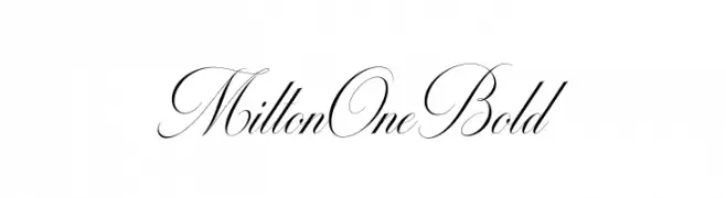
An elegant script font with flowing, cursive letterforms and ornate flourishes.
![MiltonOneBold 免费字体下载]() 下载 3924 下载@WebFont
下载 3924 下载@WebFont -
![AovelSans-Light 免费字体下载]() 下载 3924 下载@WebFont
下载 3924 下载@WebFont -
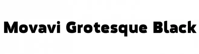
![Movavi Grotesque Black 免费字体下载]() 下载 3924 下载@WebFont
下载 3924 下载@WebFont -
( Khurasan - Syaf Rizal - creativemarket.com/khurasan?u=khurasan )
A dynamic and fluid script font with elegant, flowing letterforms.
![Tahu! 免费字体下载]() 下载 3923 下载@WebFont
下载 3923 下载@WebFont -
( Fonts by Manfred Klein - manfred-klein.ina-mar.com )
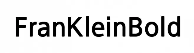
A bold, modern sans-serif font with excellent readability.
![FranKleinBold 免费字体下载]() 下载 3923 下载@WebFont
下载 3923 下载@WebFont -
( Copyright (c) 2011, Dario Manuel Muhafara (http://www.tipo.net.ar) )
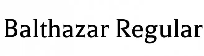
A classic serif font with elegant proportions and refined serifs.
![Balthazar Regular 免费字体下载]() 下载 3923 下载@WebFont
下载 3923 下载@WebFont


当前最热门的字体有哪些?
设计师偏爱 ViaGrande Stripe Bold, Mitr-Medium, MontserratSubrayada-Bold, Noto Sans ExtraCondensed Bold and Raspoutine Classic Italic,因为其造型干净、适用范围广—— 从品牌识别到落地页、海报都能胜任。
Logo 最常用哪些字体?
几何 无衬线(如 Poppins、Gotham 风格家族)常用于打造简洁、可扩展的品牌。 想要更亲和,可以考虑 手写体 与手写风格。 用有力量的标题字体搭配中性的正文字体,能兼顾识别度与平衡感。
热门列表多久更新一次?
我们会根据实时下载与互动数据定期刷新。 记得常来看看,抢先发现下一波“爆款”。
💡 小贴士:把本页加入书签——趋势变化很快,今天的热门 可能会启发明天的品牌升级。