欢迎来到 热门字体 专区——在这里,人气与品质兼具。 这些是今年社区下载量最高、使用最广的字体。 如果你想快速选到不踩雷的字体(Logo、网页、社媒皆宜),从这里开始。
每款 热门字体 都在平衡性、可读性与通用性方面表现出色。 你会看到现代无衬线、优雅手写体、复古衬线以及极简展示体等。
-
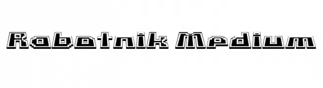
( Fonts by Vladimir Nikolic - Personal-use only. For commercial use please contact owner. )
A bold, geometric font with a retro 3D video game aesthetic.
 下载 28 下载@WebFont
 -
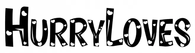
( Fonts by Inermedia Studio - Personal-use only. For commercial use please contact owner. )
A playful, bold font with polka dot patterns and cartoonish style.
![Hurry Loves 免费字体下载]() 下载 28 下载@WebFont
下载 28 下载@WebFont -
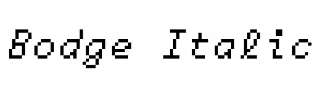
( Fonts by UkiyoMoji Fonts - Haley Wakamatsu - Personal-use only. For commercial use please contact owner. )
A pixelated, monospaced italic font with a retro digital aesthetic.
![Bodge Italic 免费字体下载]() 下载 28 下载@WebFont
下载 28 下载@WebFont -
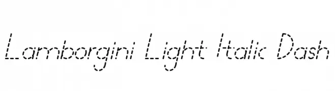
( Fonts by bey Design - Personal-use only. For commercial use please contact owner. )
A modern, italicized font with a unique dashed line style.
![Lamborgini Light Italic Dash 免费字体下载]() 下载 28 下载@WebFont
下载 28 下载@WebFont -
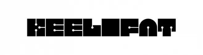
( Fonts by Dominik Krotscheck - Personal-use only. For commercial use please contact owner. )
A bold, geometric font with futuristic and symmetrical design elements.
![Keel Fat 免费字体下载]() 下载 28 下载@WebFont
下载 28 下载@WebFont -
-
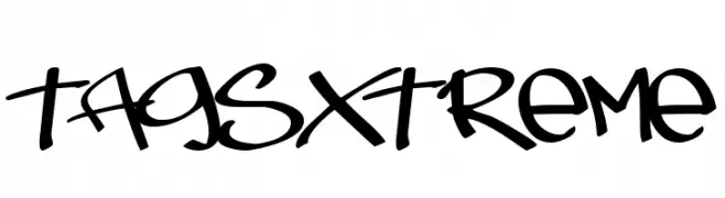
( Fonts by Pizzadude - Jakob Fischer - Personal-use only. For commercial use please contact owner. )
A bold, graffiti-inspired font with dynamic, flowing lines and an urban edge.
![TagsXtreme 免费字体下载]() 下载 28 下载@WebFont
下载 28 下载@WebFont -
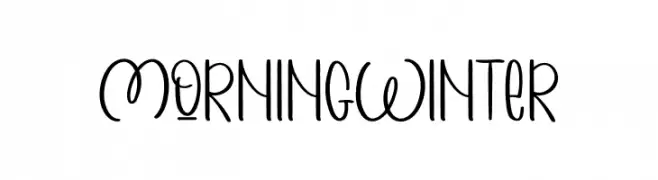
( Fonts by Inermedia Studio - Personal-use only. For commercial use please contact owner. )
A playful, handwritten font with a modern and whimsical style.
![MORNING WINTER 免费字体下载]() 下载 28 下载@WebFont
下载 28 下载@WebFont -
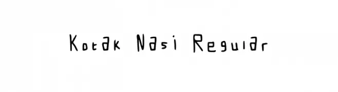
( Fonts by latifatu Anisa - Personal-use only. For commercial use please contact owner. )
A playful, handwritten font with thin, irregular strokes and a casual style.
![Kotak Nasi Regular 免费字体下载]() 下载 28 下载@WebFont
下载 28 下载@WebFont -
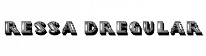
( Fonts by Vladimir Nikolic - www.creativefabrica.com/designer/vladimirnikolic/ - Personal-use only. For commercial use please contact owner. )
A bold, 3D font with a vintage, decorative style.
![Ressa 3D Regular 免费字体下载]() 下载 28 下载@WebFont
下载 28 下载@WebFont -
( Fonts by AukimVisuel - Audry Kitoko Makelele - Personal-use only. For commercial use please contact owner. )
A bold, italicized font with a modern, geometric style.
![Kumba College Italic 免费字体下载]() 下载 28 下载@WebFont
下载 28 下载@WebFont

当前最热门的字体有哪些?
设计师偏爱 Rabotnik Medium, Hurry Loves, Bodge Italic, Lamborgini Light Italic Dash and Keel Fat,因为其造型干净、适用范围广—— 从品牌识别到落地页、海报都能胜任。
Logo 最常用哪些字体?
几何 无衬线(如 Poppins、Gotham 风格家族)常用于打造简洁、可扩展的品牌。 想要更亲和,可以考虑 手写体 与手写风格。 用有力量的标题字体搭配中性的正文字体,能兼顾识别度与平衡感。
热门列表多久更新一次?
我们会根据实时下载与互动数据定期刷新。 记得常来看看,抢先发现下一波“爆款”。
💡 小贴士:把本页加入书签——趋势变化很快,今天的热门 可能会启发明天的品牌升级。