欢迎来到 热门字体 专区——在这里,人气与品质兼具。 这些是今年社区下载量最高、使用最广的字体。 如果你想快速选到不踩雷的字体(Logo、网页、社媒皆宜),从这里开始。
每款 热门字体 都在平衡性、可读性与通用性方面表现出色。 你会看到现代无衬线、优雅手写体、复古衬线以及极简展示体等。
-
( Fonts by Out of Step Font Company - Dan Steinbok - Personal-use only. For commercial use please contact owner. )
A bold slab serif font with strong, structured characters and uniform stroke width.
 下载 25 下载@WebFont
 -
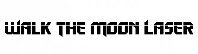
( Fonts by Iconian Fonts - Daniel Zadorozny - Personal-use only. For commercial use please contact owner. )
A bold, futuristic font with sharp angles and geometric shapes.
![Walk The Moon Laser 免费字体下载]() 下载 25 下载@WebFont
下载 25 下载@WebFont -
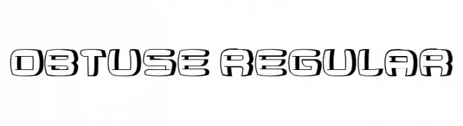
( Fonts by Vladimir Nikolic - Personal-use only. For commercial use please contact owner. )
A bold, futuristic font with a three-dimensional outline style.
![Obtuse Regular 免费字体下载]() 下载 25 下载@WebFont
下载 25 下载@WebFont -
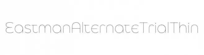
( Fonts by Zetafonts - Personal-use only. For commercial use please contact owner. )
A thin, modern font with clean lines and geometric shapes.
![Eastman Alternate Trial Thin 免费字体下载]() 下载 25 下载@WebFont
下载 25 下载@WebFont -
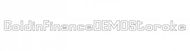
( Fonts by Edric Studio - Personal-use only. For commercial use please contact owner. )
A geometric, outlined font with a modern and technical style.
![Goldin Finance DEMO Storoke 免费字体下载]() 下载 25 下载@WebFont
下载 25 下载@WebFont -
-
( Fonts by Satriya Anggun - Personal-use only. For commercial use please contact owner. )
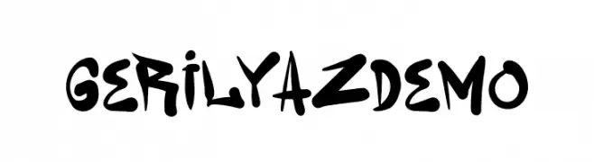
A bold, dynamic handwritten font with playful, energetic strokes.
![Gerilyaz Demo 免费字体下载]() 下载 25 下载@WebFont
下载 25 下载@WebFont -
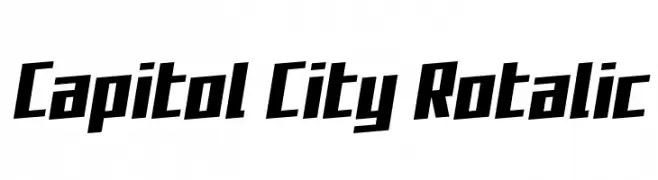
( Fonts by Iconian Fonts )
A bold, angular font with a dynamic, slanted design.
![Capitol City Rotalic 免费字体下载]() 下载 25 下载@WebFont
下载 25 下载@WebFont -
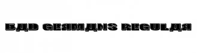
( Fonts by Vladimir Nikolic - www.creativefabrica.com/designer/vladimirnikolic/ - Personal-use only. For commercial use please contact owner. )
A bold, three-dimensional font with a strong, blocky design.
![Bad Germans Regular 免费字体下载]() 下载 25 下载@WebFont
下载 25 下载@WebFont -
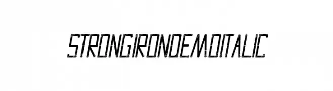
( Fonts by Edric Studio - Personal-use only. For commercial use please contact owner. )
A bold, italic font with a geometric and distressed design, ideal for impactful visuals.
![Strong Iron Demo Italic 免费字体下载]() 下载 25 下载@WebFont
下载 25 下载@WebFont -
( Fonts by AZ Std - Muh Aswar - Personal-use only. For commercial use please contact owner. )
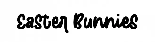
A bold, playful, hand-drawn font with rounded, connected characters.
![Easter Bunnies 免费字体下载]() 下载 25 下载@WebFont
下载 25 下载@WebFont
当前最热门的字体有哪些?
设计师偏爱 Sebastien Slab Demo, Walk The Moon Laser, Obtuse Regular, Eastman Alternate Trial Thin and Goldin Finance DEMO Storoke,因为其造型干净、适用范围广—— 从品牌识别到落地页、海报都能胜任。
Logo 最常用哪些字体?
几何 无衬线(如 Poppins、Gotham 风格家族)常用于打造简洁、可扩展的品牌。 想要更亲和,可以考虑 手写体 与手写风格。 用有力量的标题字体搭配中性的正文字体,能兼顾识别度与平衡感。
热门列表多久更新一次?
我们会根据实时下载与互动数据定期刷新。 记得常来看看,抢先发现下一波“爆款”。
💡 小贴士:把本页加入书签——趋势变化很快,今天的热门 可能会启发明天的品牌升级。