欢迎来到 热门字体 专区——在这里,人气与品质兼具。 这些是今年社区下载量最高、使用最广的字体。 如果你想快速选到不踩雷的字体(Logo、网页、社媒皆宜),从这里开始。
每款 热门字体 都在平衡性、可读性与通用性方面表现出色。 你会看到现代无衬线、优雅手写体、复古衬线以及极简展示体等。
-
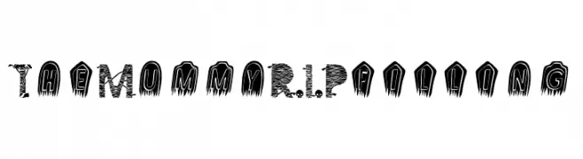
( Fonts by Greentrik6789 - Tri Kuncoro - Personal-use only. For commercial use please contact owner. )
A spooky, mummy-themed decorative font with a textured, layered design.
 下载 20 下载@WebFont
 -
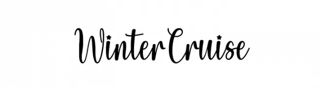
( Fonts by Wahyu Studio - Wahyu Setiyawan - Personal-use only. For commercial use please contact owner. )
A playful, elegant script font with a handwritten feel.
![Winter Cruise 免费字体下载]() 下载 20 下载@WebFont
下载 20 下载@WebFont -
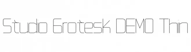
( Fonts by Jetsmax.com - Personal-use only. For commercial use please contact owner. )
A sleek, ultra-thin font with a modern, minimalist design and geometric structure.
![Studio Grotesk DEMO Thin 免费字体下载]() 下载 20 下载@WebFont
下载 20 下载@WebFont -
![Pudding 免费字体下载]() 下载 20 下载@WebFont
下载 20 下载@WebFont -
( Fonts by Edric Studio - Personal-use only. For commercial use please contact owner. )
A spooky, irregular font with sharp, dripping edges, perfect for horror themes.
![Horror Type Demo 免费字体下载]() 下载 20 下载@WebFont
下载 20 下载@WebFont -
-
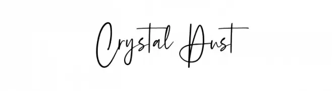
( Fonts by Geranium Space - Megi Satyo Widodo - Personal-use only. For commercial use please contact owner. )
A modern, cursive script font with elegant, elongated letters and a sleek appearance.
![Crystal Dust 免费字体下载]() 下载 20 下载@WebFont
下载 20 下载@WebFont -
( Fonts by Halymunt Studio halymuntstudio.com - Personal-use only. For commercial use please contact owner. )
A cursive, handwritten font with elegant, flowing letters.
![Redjeansky 免费字体下载]() 下载 20 下载@WebFont
下载 20 下载@WebFont -
( Fonts by Vladimir Nikolic - Personal-use only. For commercial use please contact owner. )
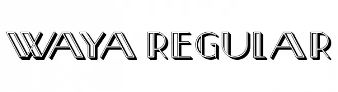
A bold, geometric font with a three-dimensional effect and sharp angles.
![Waya Regular 免费字体下载]() 下载 20 下载@WebFont
下载 20 下载@WebFont -
( Fonts by ingoFonts - Ingo Zimmermann - Personal-use only. For commercial use please contact owner. )
A sleek, thin, italic sans-serif font with a modern and elegant style.
![EconoSansRed-36ThinItalic 免费字体下载]() 下载 20 下载@WebFont
下载 20 下载@WebFont -
( Fonts by Typodermic Fonts - Raymond Larabie - Personal-use only. For commercial use please contact owner. )
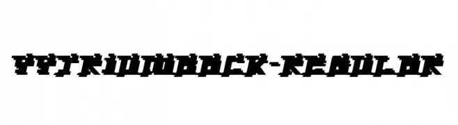
A bold, pixelated font with a retro digital aesthetic.
![YytriumBack-Regular 免费字体下载]() 下载 20 下载@WebFont
下载 20 下载@WebFont


当前最热门的字体有哪些?
设计师偏爱 The Mummy R.I.P filling, Winter Cruise, Studio Grotesk DEMO Thin, Pudding and Horror Type Demo,因为其造型干净、适用范围广—— 从品牌识别到落地页、海报都能胜任。
Logo 最常用哪些字体?
几何 无衬线(如 Poppins、Gotham 风格家族)常用于打造简洁、可扩展的品牌。 想要更亲和,可以考虑 手写体 与手写风格。 用有力量的标题字体搭配中性的正文字体,能兼顾识别度与平衡感。
热门列表多久更新一次?
我们会根据实时下载与互动数据定期刷新。 记得常来看看,抢先发现下一波“爆款”。
💡 小贴士:把本页加入书签——趋势变化很快,今天的热门 可能会启发明天的品牌升级。