欢迎来到 热门字体 专区——在这里,人气与品质兼具。 这些是今年社区下载量最高、使用最广的字体。 如果你想快速选到不踩雷的字体(Logo、网页、社媒皆宜),从这里开始。
每款 热门字体 都在平衡性、可读性与通用性方面表现出色。 你会看到现代无衬线、优雅手写体、复古衬线以及极简展示体等。
-
( Copyright 2015 by Andres Torresi. All rights reserved. )
A modern sans-serif font with clean lines and balanced proportions.
 下载 2960 下载@WebFont
 -
( KELGE Fonts - www.behance.net/contactkel17e1 )
A sharp, elongated font with a distinctive and eerie style.
![American Horror Story Promo 免费字体下载]() 下载 2959 下载@WebFont
下载 2959 下载@WebFont -
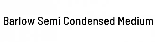
( Copyright 2017 The Barlow Project Authors (https://github.com/jpt/barlow) )
A modern, semi-condensed typeface with clean lines and uniform stroke width.
![Barlow Semi Condensed Medium 免费字体下载]() 下载 2959 下载@WebFont
下载 2959 下载@WebFont -
( Fonts by Castcraft Software - opti.netii.net - check the website before use )
A bold, high-contrast serif font with strong, authoritative strokes.
![OPTIEinstein-Black 免费字体下载]() 下载 2959 下载@WebFont
下载 2959 下载@WebFont -
( Fonts by www.omniglot.com )
A modern, geometric font with clean lines and rounded edges.
![Karenni 免费字体下载]() 下载 2959 下载
下载 2959 下载 -
-
![Wagner Zip-Change 免费字体下载]() 下载 2959 下载@WebFont
下载 2959 下载@WebFont -
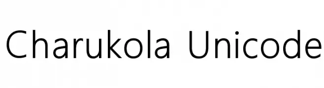
![Charukola Unicode 免费字体下载]() 下载 2958 下载@WebFont
下载 2958 下载@WebFont -
( Fonts by Graham Meade - GemFonts )
A bold, geometric font with a 3D offset shadow effect.
![11S01 Black Tuesday Offset 免费字体下载]() 下载 2958 下载@WebFont
下载 2958 下载@WebFont -
![Toreadore 免费字体下载]() 下载 2957 下载@WebFont
下载 2957 下载@WebFont -
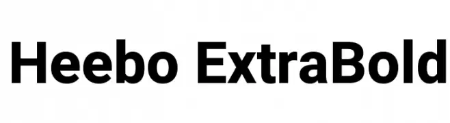
( Copyright 2014 The Heebo Project Authors. )
A bold, modern sans-serif font with clean, uniform letterforms.
![Heebo ExtraBold 免费字体下载]() 下载 2957 下载@WebFont
下载 2957 下载@WebFont -
( Copyright (c) 2010, 2011 by vernon adams (vern@newtypography.co.uk) )
A bold, rounded serif font with a modern twist and smooth curves.
![Corben 免费字体下载]() 下载 2956 下载@WebFont
下载 2956 下载@WebFont -
( Fonts by Bartek Nowak - www.nowak.tv/fontoholic/ )
A bold, playful font with an organic, hand-drawn style.
![HongKong 免费字体下载]() 下载 2956 下载@WebFont
下载 2956 下载@WebFont -
![TC _Wedding4 免费字体下载]() 下载 2955 下载@WebFont
下载 2955 下载@WebFont -
( Copyright (c) 2011 by Brenda Gallo (gbrenda1987@gmail.com), with Reserved Font Name "Happy Monkey". )
A modern, rounded font with a friendly and clean design.
![HappyMonkey 免费字体下载]() 下载 2955 下载@WebFont
下载 2955 下载@WebFont -
( Copyright (c) 2008-2010 by Jovanny Lemonad (http://www.jovanny.ru) )
A playful, handwritten font with smooth curves and a casual style.
![Neucha 免费字体下载]() 下载 2955 下载@WebFont
下载 2955 下载@WebFont -
![Bernadette Rough 免费字体下载]() 下载 2954 下载@WebFont
下载 2954 下载@WebFont -
( Fonts by a Situjuh Nazara - c7n1.wordpress.com. Personal-use only. For commercial use please contact owner. )
A bold, italic, and condensed font with a modern and dynamic style.
![Gobold Italic Italic 免费字体下载]() 下载 2954 下载@WebFont
下载 2954 下载@WebFont -
![RaiLowercase 免费字体下载]() 下载 2954 下载@WebFont
下载 2954 下载@WebFont -
( Fonts by Maelle.K - Thomas Boucherie )
A dynamic and elegant script font with flowing, cursive letterforms.
![Olympic Branding 免费字体下载]() 下载 2953 下载@WebFont
下载 2953 下载@WebFont -
![Franciscan Regular 免费字体下载]() 下载 2952 下载@WebFont
下载 2952 下载@WebFont -
( Fonts by Ariq Sya - marsnev.com )
A bold, geometric font with a modern and striking appearance.
![Dopest by MARSNEV 免费字体下载]() 下载 2951 下载@WebFont
下载 2951 下载@WebFont -
![Aller Italic 免费字体下载]() 下载 2951 下载@WebFont
下载 2951 下载@WebFont -
( Fontry - M.G. Adkins - www.thefontry.com/ )
A bold, geometric font with strong, uniform strokes for impactful design.
![RACE1 Brannt NCV 免费字体下载]() 下载 2950 下载@WebFont
下载 2950 下载@WebFont -
( Fonts by antoniorodriguesjr.com )
A modern, geometric sans-serif font with clean lines and balanced proportions.
![Berlin 免费字体下载]() 下载 2950 下载@WebFont
下载 2950 下载@WebFont -
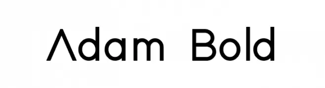
( Fonts by Adam Nördling - Personal-use only. For commercial use please contact owner. )
A modern, bold sans-serif font with geometric influences and excellent readability.
![Adam Bold 免费字体下载]() 下载 2949 下载@WebFont
下载 2949 下载@WebFont -
( Copyright (c) 2011-2012, Julieta Ulanovsky (julieta.ulanovsky@gmail.com), with Reserved Font Names 'Montserrat' )
A modern sans-serif font with underlined characters, offering a bold and unique style.
![MontserratSubrayada-Regular 免费字体下载]() 下载 2949 下载@WebFont
下载 2949 下载@WebFont -
![SF Viper Squadron Solid 免费字体下载]() 下载 2949 下载@WebFont
下载 2949 下载@WebFont -
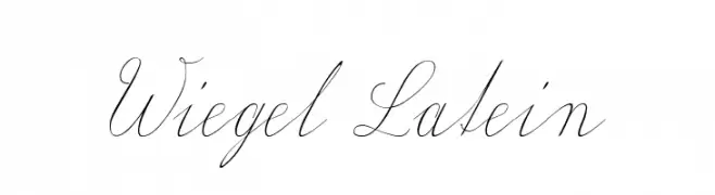
( Fonts by www.peter-wiegel.de. Personal-use only. For commercial use please contact owner. )
An elegant script font with flowing, interconnected letters and decorative flourishes.
![Wiegel Latein 免费字体下载]() 下载 2949 下载@WebFont
下载 2949 下载@WebFont -
( Fonts by ShyFonts )
A bold, futuristic font with a geometric, industrial design.
![SF Automaton Bold 免费字体下载]() 下载 2949 下载@WebFont
下载 2949 下载@WebFont -
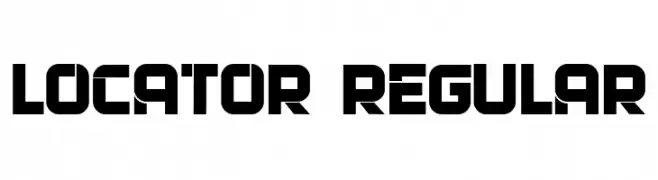
( Fonts by Vladimir Nikolic - https://www.creativefabrica.com/product/educated-deers/ref/144265/ - Personal-use only. For commercial use please contact owner. )
A bold, geometric font with a futuristic and modern design.
![Locator Regular 免费字体下载]() 下载 2948 下载@WebFont
下载 2948 下载@WebFont -
( Graphix Line Studio )
A sophisticated script font with elegant, flowing cursive letters.
![Cartier 免费字体下载]() 下载 2948 下载@WebFont
下载 2948 下载@WebFont -
![OpticianSans-Regular 免费字体下载]() 下载 2947 下载@WebFont
下载 2947 下载@WebFont -
( Fonts by Castcraft Software - opti.netii.net - check the website before use )
A classic, high-contrast serif font with a semi-compressed style.
![BodoniOpti-SemiCompressed 免费字体下载]() 下载 2947 下载@WebFont
下载 2947 下载@WebFont -
( Copyright (c) 2011 by Brian J. Bonislawsky DBA Astigmatic (AOETI) )
A bold, playful font with a quirky and whimsical style.
![SpicyRice-Regular 免费字体下载]() 下载 2947 下载@WebFont
下载 2947 下载@WebFont -
![Old newspaper font 免费字体下载]() 下载 2947 下载@WebFont
下载 2947 下载@WebFont


当前最热门的字体有哪些?
设计师偏爱 Sarala, American Horror Story Promo, Barlow Semi Condensed Medium, OPTIEinstein-Black and Karenni,因为其造型干净、适用范围广—— 从品牌识别到落地页、海报都能胜任。
Logo 最常用哪些字体?
几何 无衬线(如 Poppins、Gotham 风格家族)常用于打造简洁、可扩展的品牌。 想要更亲和,可以考虑 手写体 与手写风格。 用有力量的标题字体搭配中性的正文字体,能兼顾识别度与平衡感。
热门列表多久更新一次?
我们会根据实时下载与互动数据定期刷新。 记得常来看看,抢先发现下一波“爆款”。
💡 小贴士:把本页加入书签——趋势变化很快,今天的热门 可能会启发明天的品牌升级。