欢迎来到 热门字体 专区——在这里,人气与品质兼具。 这些是今年社区下载量最高、使用最广的字体。 如果你想快速选到不踩雷的字体(Logo、网页、社媒皆宜),从这里开始。
每款 热门字体 都在平衡性、可读性与通用性方面表现出色。 你会看到现代无衬线、优雅手写体、复古衬线以及极简展示体等。
-
( Font by Jonathan Harris - www.tattoowoo.com )
An elegant, decorative script font with intricate, swirling strokes.
 下载 717 下载@WebFont
 -
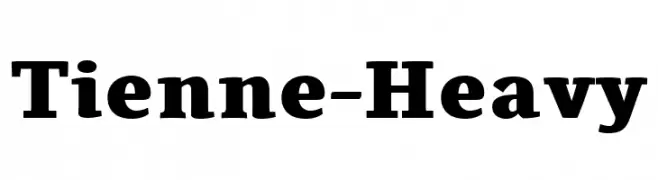
( Copyright (c) 2011, Cyreal (www.cyreal.org) )
A bold serif font with thick strokes and strong serifs, perfect for impactful headlines.
![Tienne-Heavy 免费字体下载]() 下载 717 下载@WebFont
下载 717 下载@WebFont -
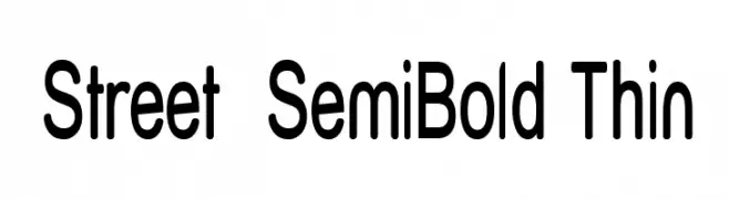
( Fonts by Apostrophic Lab )
A clean, modern sans-serif font with semi-bold weight and rounded edges.
![Street SemiBold Thin 免费字体下载]() 下载 717 下载@WebFont
下载 717 下载@WebFont -
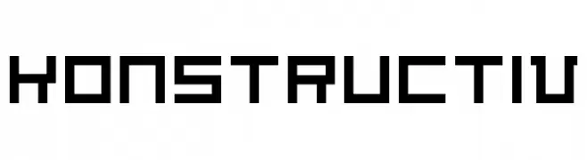
( Free - www.vnbc.fr )
A bold, geometric font with a modern, industrial feel.
![Konstructiv 免费字体下载]() 下载 717 下载@WebFont
下载 717 下载@WebFont -
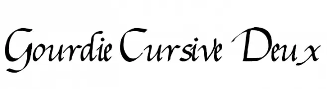
![Gourdie Cursive Deux 免费字体下载]() 下载 717 下载@WebFont
下载 717 下载@WebFont -
-
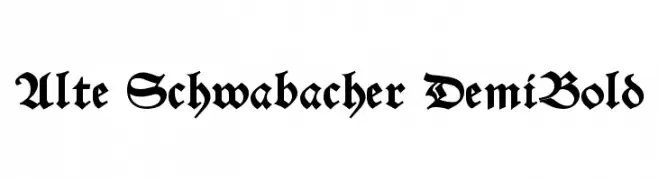
( Fonts by Dieter Steffmann )
A bold, ornate Blackletter font with high contrast and medieval flair.
![Alte Schwabacher DemiBold 免费字体下载]() 下载 717 下载@WebFont
下载 717 下载@WebFont -
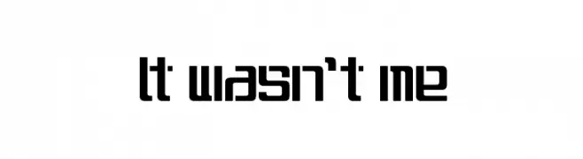
( Fonts by Dustin Norlander - www.cheapskatefonts.com )
A bold, geometric font with a modern, digital aesthetic.
![It wasn't me 免费字体下载]() 下载 717 下载@WebFont
下载 717 下载@WebFont -
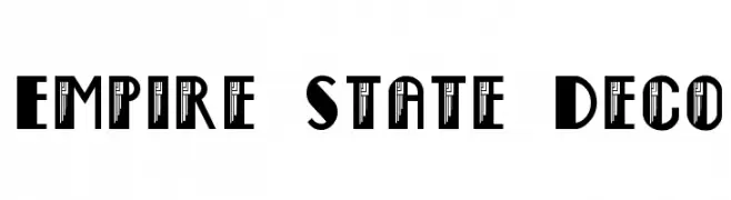
( Fonts by Steve Ferrera )
A bold, Art Deco-inspired font with geometric shapes and strong vertical lines.
![Empire State Deco 免费字体下载]() 下载 717 下载@WebFont
下载 717 下载@WebFont -
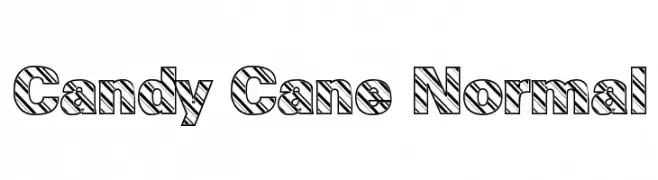
![Candy Cane Normal 免费字体下载]() 下载 717 下载@WebFont
下载 717 下载@WebFont -
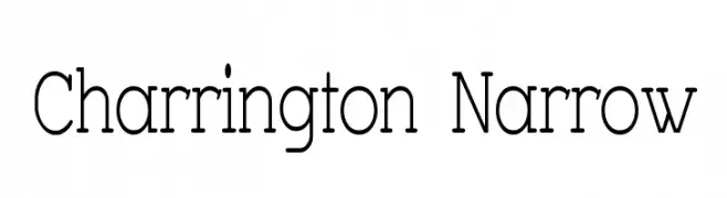
( Fonts by Apostrophic Lab )
A narrow, elegant serif font with moderate contrast and refined style.
![Charrington Narrow 免费字体下载]() 下载 717 下载@WebFont
下载 717 下载@WebFont
当前最热门的字体有哪些?
设计师偏爱 the Daily Bread, Tienne-Heavy, Street SemiBold Thin, Konstructiv and Gourdie Cursive Deux,因为其造型干净、适用范围广—— 从品牌识别到落地页、海报都能胜任。
Logo 最常用哪些字体?
几何 无衬线(如 Poppins、Gotham 风格家族)常用于打造简洁、可扩展的品牌。 想要更亲和,可以考虑 手写体 与手写风格。 用有力量的标题字体搭配中性的正文字体,能兼顾识别度与平衡感。
热门列表多久更新一次?
我们会根据实时下载与互动数据定期刷新。 记得常来看看,抢先发现下一波“爆款”。
💡 小贴士:把本页加入书签——趋势变化很快,今天的热门 可能会启发明天的品牌升级。