欢迎来到 热门字体 专区——在这里,人气与品质兼具。 这些是今年社区下载量最高、使用最广的字体。 如果你想快速选到不踩雷的字体(Logo、网页、社媒皆宜),从这里开始。
每款 热门字体 都在平衡性、可读性与通用性方面表现出色。 你会看到现代无衬线、优雅手写体、复古衬线以及极简展示体等。
-
( Download for Personal Use. For Commercial: http://www.k-type.com )
A bold, distressed font with a rugged, vintage look.
 下载 2268 下载@WebFont
 -
( Copyright (c) 2010, Sebastian Kosch (sebastian@aldusleaf.org) )
A bold, italic serif font with a classic and elegant style.
![Crimson Text Bold Italic 免费字体下载]() 下载 2268 下载@WebFont
下载 2268 下载@WebFont -
![VI Thanh Mai 免费字体下载]() 下载 2268 下载@WebFont
下载 2268 下载@WebFont -
( Fonts by Castcraft Software - opti.netii.net - check the website before use )
A classic serif font with elegant, thin strokes and a timeless appeal.
![OPTICubaLibreTwo 免费字体下载]() 下载 2267 下载@WebFont
下载 2267 下载@WebFont -
( Fonts by Castcraft Software - opti.netii.net - check the website before use )
A bold, geometric font with a modern and artistic style.
![OPTIAsian 免费字体下载]() 下载 2267 下载@WebFont
下载 2267 下载@WebFont -
![kaliGraff 免费字体下载]() 下载 2267 下载@WebFont
下载 2267 下载@WebFont -
( Fonts by Type With Pride - www.typewithpride.com. For commercial use please contact owner. )
A bold, modern sans-serif font with geometric and clean lines.
![Gilbert Bold - Preview4 免费字体下载]() 下载 2266 下载@WebFont
下载 2266 下载@WebFont -
( Weape Design - creativemarket.com/weape?u=weape )
A bold, flowing script font with elegant cursive letterforms.
![Andora Demo 免费字体下载]() 下载 2266 下载@WebFont
下载 2266 下载@WebFont -
( Fonts by Manfred Klein. Free for private and charity use. Free for commercial with donation to organizations )
A bold and ornate Blackletter font with a medieval aesthetic.
![Schwabach 免费字体下载]() 下载 2266 下载@WebFont
下载 2266 下载@WebFont -
![Gaze Bold 免费字体下载]() 下载 2266 下载@WebFont
下载 2266 下载@WebFont -
( Fonts by Zetafonts - Personal-use only. For commercial use please contact owner. )
A bold, italic font with high contrast and tight spacing, perfect for impactful headlines.
![HeadingNow Trial 47 Extrabold Italic 免费字体下载]() 下载 2265 下载@WebFont
下载 2265 下载@WebFont -
( Iconian Fonts - Daniel Zadorozny - www.iconian.com )
A bold, geometric, and condensed font ideal for modern and impactful designs.
![Spy Agency Condensed 免费字体下载]() 下载 2265 下载@WebFont
下载 2265 下载@WebFont -
![Adhawin-Tamil Regular 免费字体下载]() 下载 2265 下载@WebFont
下载 2265 下载@WebFont -
( Fonts by Daniel Zadorozny - www.iconian.com - Free for personal use )
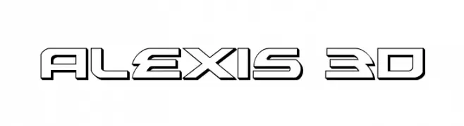
A bold, 3D futuristic font with geometric shapes and sharp angles.
![Alexis 3D 免费字体下载]() 下载 2265 下载@WebFont
下载 2265 下载@WebFont -
![ER Kurier Mac 免费字体下载]() 下载 2265 下载@WebFont
下载 2265 下载@WebFont -
![Esperanza!]() 下载 2265 下载@WebFont
下载 2265 下载@WebFont -
![Aster1 免费字体下载]() 下载 2265 下载@WebFont
下载 2265 下载@WebFont -
( Fonts by www.fontmenu.com )
A modern, clean sans-serif font with uniform strokes and geometric influences.
![Normafixed Tryout 免费字体下载]() 下载 2265 下载@WebFont
下载 2265 下载@WebFont -
( Fonts by Sang Seo - LALATO FONTS. Personal-use only. For commercial use please contact owner. )
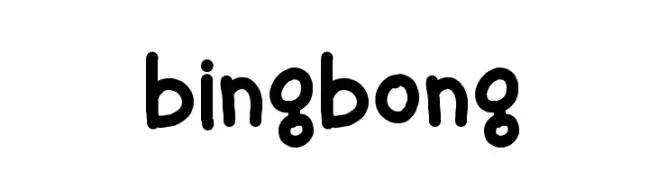
A playful, rounded handwritten font with a whimsical and friendly style.
![bingbong 免费字体下载]() 下载 2264 下载@WebFont
下载 2264 下载@WebFont -
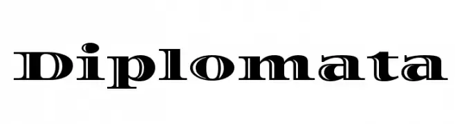
( Copyright (c) 2011, Eduardo Tunni (http://www.tipo.net.ar) )
A classic serif font with elegant curves and sharp serifs, perfect for formal and modern uses.
![Diplomata 免费字体下载]() 下载 2264 下载@WebFont
下载 2264 下载@WebFont -
( Fonts by Dieter Steffmann )
A bold blackletter font with intricate detailing and angular strokes.
![Becker 免费字体下载]() 下载 2264 下载@WebFont
下载 2264 下载@WebFont -
( Fonts by Castcraft Software - OPTI Fonts Archive - opti.netii.net - Personal-use only. For commercial use please contact owner. )
A bold, high-contrast serif font with elongated characters and sharp serifs.
![OPTIProtea 免费字体下载]() 下载 2263 下载@WebFont
下载 2263 下载@WebFont -
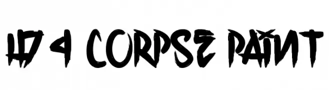
( Fonts by www.legacyofdefeat.com )
A bold, hand-painted style font with energetic and expressive strokes.
![H74 Corpse Paint 免费字体下载]() 下载 2262 下载@WebFont
下载 2262 下载@WebFont -
( Fonts by www.waltervelezart.com )
A bold, brush-style font with dynamic, slanted strokes.
![True Crimes 免费字体下载]() 下载 2262 下载@WebFont
下载 2262 下载@WebFont -
( Fonts by Wahyu Eka Prasetya - wepfont.com - Personal-use only. For commercial use please contact owner. )
A fluid and elegant handwritten cursive font.
![Finding 免费字体下载]() 下载 2261 下载@WebFont
下载 2261 下载@WebFont -
( Fonts by Fonts by Rasmus Andersson / Changes by Cristiano Sobral with parts from Marc Monis - Personal-use only. For commercial use please contact owner. )
A modern, clean sans-serif font with uniform strokes and balanced proportions.
![LinikSans-Medium 免费字体下载]() 下载 2261 下载@WebFont
下载 2261 下载@WebFont -
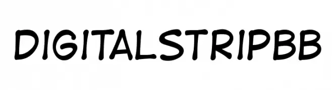
( Fonts by www.blambot.com )
A playful, handwritten font with rounded, consistent strokes and a casual vibe.
![DigitalStripBB 免费字体下载]() 下载 2261 下载@WebFont
下载 2261 下载@WebFont -
( Fonts by Castcraft Software - OPTI Fonts Archive - opti.netii.net - Personal-use only. For commercial use please contact owner. )
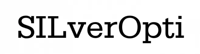
A classic slab serif font with bold, block-like serifs and a strong, authoritative presence.
![SILverOpti 免费字体下载]() 下载 2260 下载@WebFont
下载 2260 下载@WebFont -
( Fonts by skomii - Personal-use only. For commercial use please contact owner. )
A modern, geometric sans-serif font with clean lines and balanced proportions.
![Stark 免费字体下载]() 下载 2260 下载@WebFont
下载 2260 下载@WebFont -
( Fonts by or from www.graffitifonts.net )
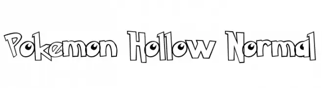
A playful, hollow, outlined font with a cartoon-like, comic book style.
![Pokemon Hollow Normal 免费字体下载]() 下载 2260 下载
下载 2260 下载 -
![Italian Cursive, 16th Century 免费字体下载]() 下载 2260 下载
下载 2260 下载 -
( Fonts by http://perso.calixo.net/~uzim/ )
A playful, casual handwritten font with irregular strokes and a whimsical appearance.
![Origin 免费字体下载]() 下载 2260 下载@WebFont
下载 2260 下载@WebFont -
( گالری فانت فارسی پژوهش آريانا - only compatible with Farsi and Arabic )
A bold, angular font with a futuristic and geometric style.
![Quark 免费字体下载]() 下载 2260 下载@WebFont
下载 2260 下载@WebFont -
( Fonts by Peter Wiegel - Personal-use only. For commercial use please contact owner. )
A bold, modern font with geometric shapes and consistent width.
![AurachHeavy 免费字体下载]() 下载 2259 下载@WebFont
下载 2259 下载@WebFont -
( Copyright 2017 The Vollkorn Project Authors (https://github.com/FAlthausen/Vollkorn-Typeface) )
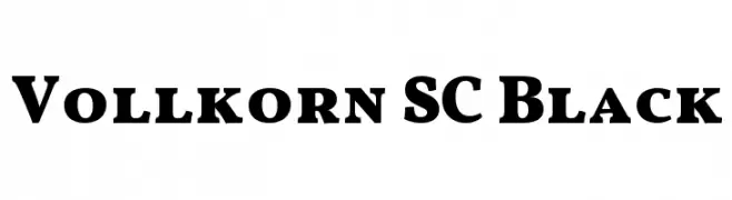
A bold, serif typeface with strong strokes and classic serifs.
![Vollkorn SC Black 免费字体下载]() 下载 2259 下载@WebFont
下载 2259 下载@WebFont


当前最热门的字体有哪些?
设计师偏爱 SansCulottes, Crimson Text Bold Italic, VI Thanh Mai, OPTICubaLibreTwo and OPTIAsian,因为其造型干净、适用范围广—— 从品牌识别到落地页、海报都能胜任。
Logo 最常用哪些字体?
几何 无衬线(如 Poppins、Gotham 风格家族)常用于打造简洁、可扩展的品牌。 想要更亲和,可以考虑 手写体 与手写风格。 用有力量的标题字体搭配中性的正文字体,能兼顾识别度与平衡感。
热门列表多久更新一次?
我们会根据实时下载与互动数据定期刷新。 记得常来看看,抢先发现下一波“爆款”。
💡 小贴士:把本页加入书签——趋势变化很快,今天的热门 可能会启发明天的品牌升级。