欢迎来到 热门字体 专区——在这里,人气与品质兼具。 这些是今年社区下载量最高、使用最广的字体。 如果你想快速选到不踩雷的字体(Logo、网页、社媒皆宜),从这里开始。
每款 热门字体 都在平衡性、可读性与通用性方面表现出色。 你会看到现代无衬线、优雅手写体、复古衬线以及极简展示体等。
-
( Fonts by Kevin Christopher - www.kcfonts.com )
A bold, distressed font with a grunge, textured appearance.
 下载 320 下载@WebFont
 -
![Cherished Teddies 免费字体下载]() 下载 320 下载@WebFont
下载 320 下载@WebFont -
( K-Type - www.k-type.com )
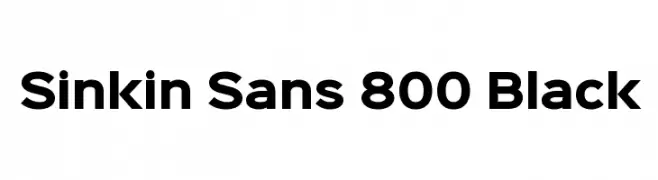
A bold, geometric sans-serif font with a modern and clean aesthetic.
![Sinkin Sans 800 Black 免费字体下载]() 下载 320 下载@WebFont
下载 320 下载@WebFont -
( Fonts by Apostrophic Lab )
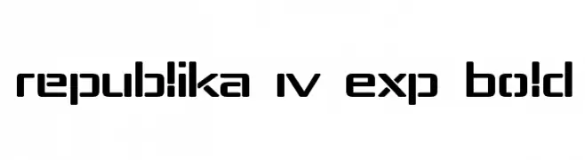
A bold, modern font with geometric shapes and rounded corners.
![Republika IV Exp Bold 免费字体下载]() 下载 320 下载@WebFont
下载 320 下载@WebFont -
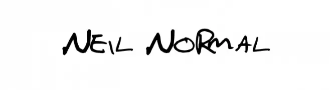
![Neil Normal 免费字体下载]() 下载 320 下载@WebFont
下载 320 下载@WebFont -
-
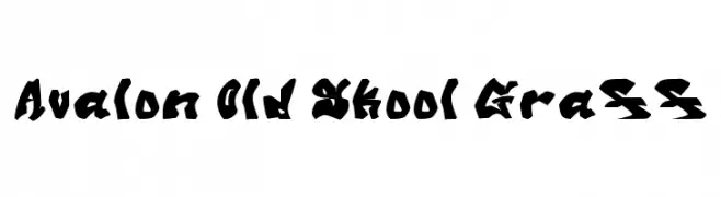
![Avalon Old Skool Graff 免费字体下载]() 下载 320 下载@WebFont
下载 320 下载@WebFont -
( Fonts by Jeri Ingalls - littlehouse.homestead.com )
A decorative font with intricate kaleidoscope-inspired geometric designs.
![JI Kaleidoscope Bats 免费字体下载]() 下载 320 下载@WebFont
下载 320 下载@WebFont -
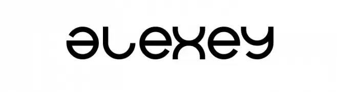
( Fonts by weknow - Wino S Kadir )
A modern, geometric font with smooth lines and a futuristic style.
![alexey 免费字体下载]() 下载 320 下载@WebFont
下载 320 下载@WebFont -
( Fonts by Daniel Zadorozny - www.iconian.com - Personal-use only. For commercial use please contact owner. )
A bold, geometric font with a futuristic style and strong visual impact.
![Pilot Command Spaced 免费字体下载]() 下载 320 下载@WebFont
下载 320 下载@WebFont -
( Fonts by Meir Sadan - www.sadan.com OFF SITE )
A playful, hand-drawn font with whimsical and irregular letterforms.
![Lovitz 免费字体下载]() 下载 320 下载
下载 320 下载


当前最热门的字体有哪些?
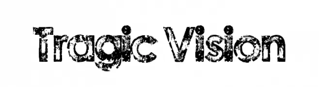
设计师偏爱 Tragic Vision, Cherished Teddies, Sinkin Sans 800 Black, Republika IV Exp Bold and Neil Normal,因为其造型干净、适用范围广—— 从品牌识别到落地页、海报都能胜任。
Logo 最常用哪些字体?
几何 无衬线(如 Poppins、Gotham 风格家族)常用于打造简洁、可扩展的品牌。 想要更亲和,可以考虑 手写体 与手写风格。 用有力量的标题字体搭配中性的正文字体,能兼顾识别度与平衡感。
热门列表多久更新一次?
我们会根据实时下载与互动数据定期刷新。 记得常来看看,抢先发现下一波“爆款”。
💡 小贴士:把本页加入书签——趋势变化很快,今天的热门 可能会启发明天的品牌升级。