欢迎来到 热门字体 专区——在这里,人气与品质兼具。 这些是今年社区下载量最高、使用最广的字体。 如果你想快速选到不踩雷的字体(Logo、网页、社媒皆宜),从这里开始。
每款 热门字体 都在平衡性、可读性与通用性方面表现出色。 你会看到现代无衬线、优雅手写体、复古衬线以及极简展示体等。
-
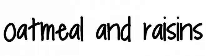
( Fonts by MonkeyRoodles Fonts )
A playful, handwritten font with a casual and friendly style.
 下载 627 下载@WebFont
 -
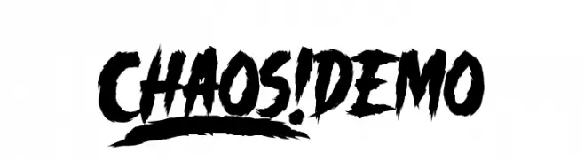
( Fonts by Knackpack Studio - www.knackpack.studio - Personal-use only. For commercial use please contact owner. )
A bold, jagged font with a chaotic and energetic style.
![_CHAOS! DEMO 免费字体下载]() 下载 627 下载@WebFont
下载 627 下载@WebFont -
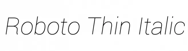
( Fonts by developer.android.com )
A sleek, modern, thin italic font with excellent legibility and a minimalist aesthetic.
![Roboto Thin Italic 免费字体下载]() 下载 627 下载@WebFont
下载 627 下载@WebFont -
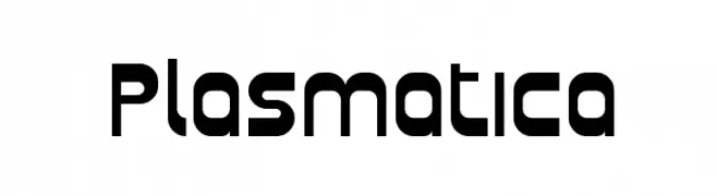
( Fonts by Apostrophic Lab )
A bold, geometric font with rounded edges and a modern, futuristic style.
![Plasmatica 免费字体下载]() 下载 627 下载@WebFont
下载 627 下载@WebFont -
( Fonts by a Emily Spadoni - http://creativemarket.com/emilyspadoni/. Personal-use only. For commercial use please contact owner. )
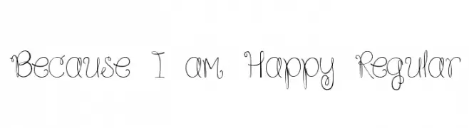
A whimsical, curly, hand-drawn font with playful loops and swirls.
![Because I am Happy Regular 免费字体下载]() 下载 627 下载@WebFont
下载 627 下载@WebFont -
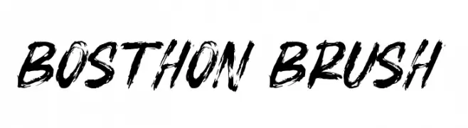
![BOSTHON BRUSH 免费字体下载]() 下载 627 下载@WebFont
下载 627 下载@WebFont -
( Fonts by weknow - Wino S Kadir )
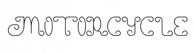
A whimsical and decorative font with intricate loops and curls.
![motorcycle 免费字体下载]() 下载 627 下载@WebFont
下载 627 下载@WebFont -
( Free - comeunbound.tumblr.com/ )
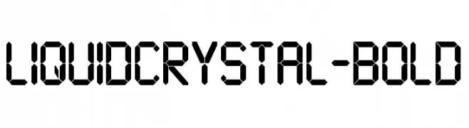
A segmented, digital-style font inspired by classic LCD displays.
![LiquidCrystal-Bold 免费字体下载]() 下载 627 下载@WebFont
下载 627 下载@WebFont -
![Dusseldorf 免费字体下载]() 下载 627 下载@WebFont
下载 627 下载@WebFont -
![LMS Daphne 免费字体下载]() 下载 627 下载@WebFont
下载 627 下载@WebFont -
![Panettone DEMO Regular 免费字体下载]() 下载 627 下载@WebFont
下载 627 下载@WebFont -
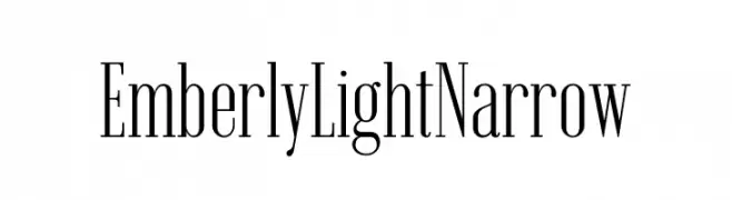
( Fonts by Rajesh Rajput - gumroad.com/rajputrajesh_448 - Personal-use only. For commercial use please contact owner. )
A refined, narrow serif font with high contrast and elegant strokes.
![Emberly Light Narrow 免费字体下载]() 下载 626 下载@WebFont
下载 626 下载@WebFont -
( Fonts by Des Gomez )
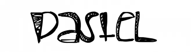
A playful, hand-drawn font with decorative elements and a whimsical style.
![Pastel 免费字体下载]() 下载 626 下载@WebFont
下载 626 下载@WebFont -
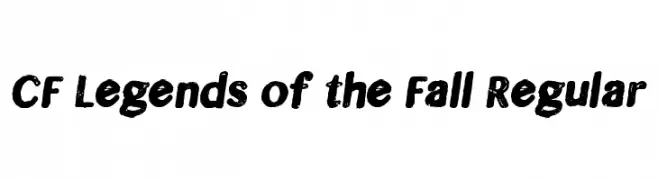
( Fonts by CloutierFontes )
A bold, distressed font with a vintage, textured style.
![CF Legends of the Fall Regular 免费字体下载]() 下载 626 下载@WebFont
下载 626 下载@WebFont -
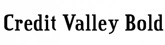
![Credit Valley Bold 免费字体下载]() 下载 626 下载@WebFont
下载 626 下载@WebFont -
![Dont Melt Drip Regular 免费字体下载]() 下载 626 下载@WebFont
下载 626 下载@WebFont -
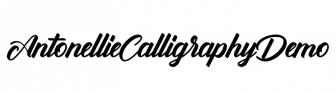
( Fonts by Ketikata Studio - Fuad Hasan - Personal-use only. For commercial use please contact owner. )
A flowing, calligraphic script font with elegant, connected strokes.
![Antonellie Calligraphy Demo 免费字体下载]() 下载 626 下载@WebFont
下载 626 下载@WebFont -
( Fonts by Agathe M.Joyce - www.foundmyfont.com - Personal-use only. For commercial use please contact owner. )
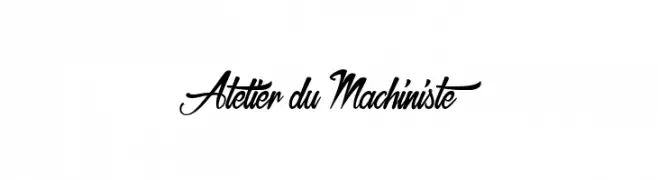
An elegant, cursive font with bold, sweeping uppercase letters and smooth, decorative lowercase characters.
![Atelier du Machiniste 免费字体下载]() 下载 626 下载@WebFont
下载 626 下载@WebFont -
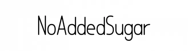
![No Added Sugar 免费字体下载]() 下载 626 下载@WebFont
下载 626 下载@WebFont -
( Fonts by Shara Weber - www.sharasfonts.com - Personal-use only. For commercial use please contact owner. )
A modern, geometric font with elongated forms and thin strokes.
![LemonCookieSans 免费字体下载]() 下载 626 下载@WebFont
下载 626 下载@WebFont -
( Fonts by Chank Co. - www.chank.com )
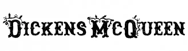
An ornate, vintage-style font with intricate flourishes and bold, decorative elements.
![DickensMcQueen 免费字体下载]() 下载 626 下载@WebFont
下载 626 下载@WebFont -
![iCielAltus 免费字体下载]() 下载 626 下载@WebFont
下载 626 下载@WebFont -
![TypographerGotisch Schmal Bold 免费字体下载]() 下载 626 下载@WebFont
下载 626 下载@WebFont -
( Fonts by www.aenigmafonts.com )
A spooky, dripping font perfect for horror themes.
![It Lives In The Swamp [BRK] 免费字体下载]() 下载 626 下载@WebFont
下载 626 下载@WebFont -
( Fonts by www.kimberlygeswein.com - Kimberly Geswein )
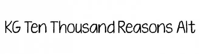
A playful, hand-drawn font with a chalk-like texture and informal style.
![KG Ten Thousand Reasons Alt 免费字体下载]() 下载 626 下载@WebFont
下载 626 下载@WebFont -
( Fonts by Daniel Zadorozny - www.iconian.com )
A sleek, modern semi-italic font with sharp angles and a dynamic appearance.
![Concielian Jet Semi-Italic 免费字体下载]() 下载 626 下载@WebFont
下载 626 下载@WebFont -
![KR Cuori Divertenti 2 免费字体下载]() 下载 626 下载@WebFont
下载 626 下载@WebFont -
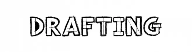
( Font by Jonathan Harris - www.tattoowoo.com )
A bold, hand-drawn font with a playful, sketched appearance.
![Drafting 免费字体下载]() 下载 626 下载@WebFont
下载 626 下载@WebFont -
( Typodermic Fonts - Ray Larabie - www.typodermicfonts.com/ )
An ultra-condensed, elongated font with thin strokes and a modern aesthetic.
![BuiltTitlingEl-Regular 免费字体下载]() 下载 626 下载@WebFont
下载 626 下载@WebFont -
![ScrapiCons 免费字体下载]() 下载 626 下载@WebFont
下载 626 下载@WebFont -
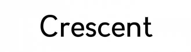
( Rachel Kozy - www.rachelkozy.com )
A modern, geometric sans-serif font with clean lines and balanced proportions.
![Crescent 免费字体下载]() 下载 626 下载@WebFont
下载 626 下载@WebFont -
( Fonts by Ramli Setiadi - Personal-use only. For commercial use please contact owner. )
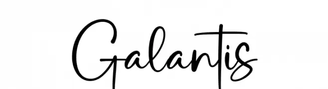
A playful and energetic script font with a handwritten style.
![Galantis 免费字体下载]() 下载 626 下载@WebFont
下载 626 下载@WebFont -
( Copyright (c) 2011, UGR Design (www.ugrdesign.com.ar) )
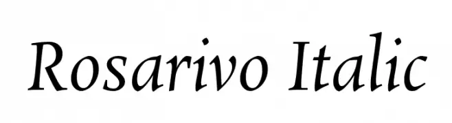
An elegant serif italic font with smooth curves and refined serifs.
![Rosarivo Italic 免费字体下载]() 下载 626 下载@WebFont
下载 626 下载@WebFont -
( Fonts by dustBUST - Andreas Nylin )
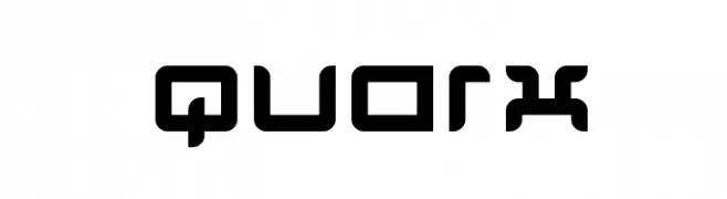
A futuristic, geometric font with bold, rounded edges and a digital aesthetic.
![Quarx 免费字体下载]() 下载 626 下载@WebFont
下载 626 下载@WebFont -
![MissBrooks Regular 免费字体下载]() 下载 626 下载@WebFont
下载 626 下载@WebFont


![It Lives In The Swamp [BRK] 免费字体下载](https://d144mzi0q5mijx.cloudfront.net/img/I/T/It-Lives-In-The-Swamp-BRK.webp)


当前最热门的字体有哪些?
设计师偏爱 oatmeal and raisins, _CHAOS! DEMO, Roboto Thin Italic, Plasmatica and Because I am Happy Regular,因为其造型干净、适用范围广—— 从品牌识别到落地页、海报都能胜任。
Logo 最常用哪些字体?
几何 无衬线(如 Poppins、Gotham 风格家族)常用于打造简洁、可扩展的品牌。 想要更亲和,可以考虑 手写体 与手写风格。 用有力量的标题字体搭配中性的正文字体,能兼顾识别度与平衡感。
热门列表多久更新一次?
我们会根据实时下载与互动数据定期刷新。 记得常来看看,抢先发现下一波“爆款”。
💡 小贴士:把本页加入书签——趋势变化很快,今天的热门 可能会启发明天的品牌升级。