欢迎来到 热门字体 专区——在这里,人气与品质兼具。 这些是今年社区下载量最高、使用最广的字体。 如果你想快速选到不踩雷的字体(Logo、网页、社媒皆宜),从这里开始。
每款 热门字体 都在平衡性、可读性与通用性方面表现出色。 你会看到现代无衬线、优雅手写体、复古衬线以及极简展示体等。
-
( Copyright (c) 2010, Jan Gerner (post@yanone.de) )
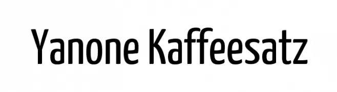
A modern, clean sans-serif font with a slightly condensed style.
 下载 5887 下载@WebFont
 -
![Xirod 免费字体下载]() 下载 5886 下载@WebFont
下载 5886 下载@WebFont -
( Copyright (c) 2012, Pablo Impallari (www.impallari.com|impallari@gmail.com) )
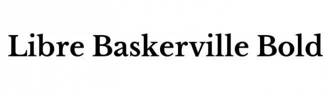
A classic serif typeface with high contrast and elegant design.
![Libre Baskerville Bold 免费字体下载]() 下载 5885 下载@WebFont
下载 5885 下载@WebFont -
![AveriaSerif-Bold 免费字体下载]() 下载 5885 下载@WebFont
下载 5885 下载@WebFont -
( Copyright 2017 The Barlow Project Authors (https://github.com/jpt/barlow) )
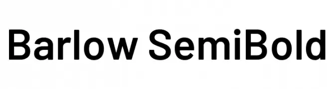
A modern, semi-bold sans-serif font with clean lines and balanced proportions.
![Barlow SemiBold 免费字体下载]() 下载 5884 下载@WebFont
下载 5884 下载@WebFont -
![TCF 50s Bold 免费字体下载]() 下载 5884 下载@WebFont
下载 5884 下载@WebFont -
( Fonts by David Espinosa - http://issuu.com/davidespinosa5/ )
A bold, rounded font with a modern and clean aesthetic.
![Round Bold 免费字体下载]() 下载 5884 下载@WebFont
下载 5884 下载@WebFont -
( Copyright 2017 The Playfair Display Project Authors (https://github.com/clauseggers/Playfair-Display), with Reserved Font Name "Playfair Display". )
A bold, high-contrast serif typeface with elegant and dramatic strokes.
![Playfair Display SC Black 免费字体下载]() 下载 5883 下载@WebFont
下载 5883 下载@WebFont -
( Fonts by Apostrophic Lab )
A modern, geometric sans-serif font with clean lines and uniform thickness.
![Asenine 免费字体下载]() 下载 5883 下载@WebFont
下载 5883 下载@WebFont -
( Fonts by www.tepidmonkey.net )
A modern, geometric font with rounded edges and uniform width.
![Monoglyceride 免费字体下载]() 下载 5879 下载@WebFont
下载 5879 下载@WebFont -
![Showcard 免费字体下载]() 下载 5877 下载@WebFont
下载 5877 下载@WebFont -
( Fonts by Jens R. Ziehn - www.filmhimmel.com )
A tall, narrow font with a hand-drawn, whimsical style.
![Men In Black Credits 免费字体下载]() 下载 5873 下载@WebFont
下载 5873 下载@WebFont -
![Misfit2 免费字体下载]() 下载 5873 下载@WebFont
下载 5873 下载@WebFont -
( A font by Jos Buivenga (exljbris) -> www.exljbris.com )
A classic serif font with small caps, offering elegance and readability.
![Fontin SmallCaps 免费字体下载]() 下载 5871 下载@WebFont
下载 5871 下载@WebFont -
![Jester Regular 免费字体下载]() 下载 5871 下载@WebFont
下载 5871 下载@WebFont -
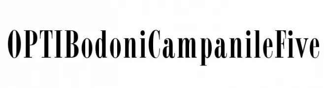
( Fonts by Castcraft Software - opti.netii.net - check the website before use )
A classic serif typeface with high contrast and elegant, elongated forms.
![OPTIBodoniCampanileFive 免费字体下载]() 下载 5870 下载@WebFont
下载 5870 下载@WebFont -
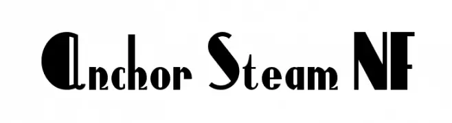
( Fonts by Nick Curtis - www.nicksfonts.com )
A bold, Art Deco-inspired font with geometric shapes and sharp angles.
![Anchor Steam NF 免费字体下载]() 下载 5870 下载@WebFont
下载 5870 下载@WebFont -
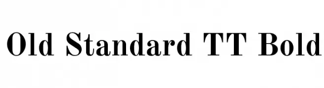
( Copyright 2011 The Old Standard Project Authors (amkryukov@gmail.com) )
A bold, classic serif font with high contrast and elegant serifs.
![Old Standard TT Bold 免费字体下载]() 下载 5867 下载@WebFont
下载 5867 下载@WebFont -
![StayGold 免费字体下载]() 下载 5866 下载@WebFont
下载 5866 下载@WebFont -
![Bad 免费字体下载]() 下载 5865 下载@WebFont
下载 5865 下载@WebFont -
( Fonts by ShyFonts )
A bold, geometric sans-serif font with a modern and clean design.
![SF Grandezza Heavy 免费字体下载]() 下载 5860 下载@WebFont
下载 5860 下载@WebFont -
字体 通过 HammerBro101. For commercial use please contact the owner.
![RoGSanSrfStd-UB 免费字体下载]() 下载 5859 下载@WebFont
下载 5859 下载@WebFont -
( Fonts by Astigmatic One Eye Typographic Institute - Brian J. Bonislawsky - astigmatic.com )
A bold, grunge-style font with a distressed, textured appearance.
![CRUSHED 免费字体下载]() 下载 5856 下载@WebFont
下载 5856 下载@WebFont -
( Fonts by Casady & Greene )
A bold, italicized font with extended, sleek letterforms and a modern aesthetic.
![MicroExtendFLF-BoldItalic 免费字体下载]() 下载 5851 下载@WebFont
下载 5851 下载@WebFont -
( Fonts by www.peter-wiegel.de. Personal-use only. For commercial use please contact owner. )
A graceful script font with fluid, interconnected strokes and a cursive style.
![Discipuli Britannica 免费字体下载]() 下载 5850 下载@WebFont
下载 5850 下载@WebFont -
( Fonts by omnibus-type.com. Personal-use only. For commercial use please contact owner. )
A modern sans-serif font with clean lines and excellent readability.
![Asap Symbol 免费字体下载]() 下载 5846 下载@WebFont
下载 5846 下载@WebFont -
( Copyright (c) 2011, Edgar Tolentino and Pablo Impallari (www.impallari.com|impallari@gmail.com) )
A modern, rounded sans-serif font with a friendly and clean appearance.
![Dosis Bold 免费字体下载]() 下载 5846 下载@WebFont
下载 5846 下载@WebFont -
![Score Board 免费字体下载]() 下载 5845 下载@WebFont
下载 5845 下载@WebFont -
![Battlestar 免费字体下载]() 下载 5841 下载@WebFont
下载 5841 下载@WebFont -
( Fonts by Julieta Ulanovsky (font) & Cristiano Sobral (main changes) - Personal-use only. For commercial use please contact owner. )
A modern, semi-bold sans-serif font with clean lines and balanced proportions.
![Argentum Novus SemiBold 免费字体下载]() 下载 5837 下载@WebFont
下载 5837 下载@WebFont -
![DK Longreach Regular 免费字体下载]() 下载 5836 下载@WebFont
下载 5836 下载@WebFont -
( Fonts by Bryan S.O. )
A playful, bold font with rounded, bubbly characters ideal for fun and creative projects.
![nickelodeon, Bryan S.O. 免费字体下载]() 下载 5836 下载@WebFont
下载 5836 下载@WebFont -
( Fonts by Denise Bentulan - douxiegirl.com. Personal-use only. For commercial use please contact owner. )
A playful, rounded font with a whimsical and friendly style.
![BabyDoll 免费字体下载]() 下载 5836 下载@WebFont
下载 5836 下载@WebFont -
( Fonts by bob istheowl http://luc.devroye.org/bobistheowl.html )
Whimsical cartoon character with bold black and white styling.
![Grim Natwick Betty Boop 免费字体下载]() 下载 5836 下载@WebFont
下载 5836 下载@WebFont -
( Fonts by Casady & Greene )
A flowing, cursive script font with elegant, connected characters.
![PhoenixScriptFLF 免费字体下载]() 下载 5835 下载@WebFont
下载 5835 下载@WebFont


当前最热门的字体有哪些?
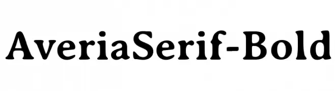
设计师偏爱 Yanone Kaffeesatz, Xirod, Libre Baskerville Bold, AveriaSerif-Bold and Barlow SemiBold,因为其造型干净、适用范围广—— 从品牌识别到落地页、海报都能胜任。
Logo 最常用哪些字体?
几何 无衬线(如 Poppins、Gotham 风格家族)常用于打造简洁、可扩展的品牌。 想要更亲和,可以考虑 手写体 与手写风格。 用有力量的标题字体搭配中性的正文字体,能兼顾识别度与平衡感。
热门列表多久更新一次?
我们会根据实时下载与互动数据定期刷新。 记得常来看看,抢先发现下一波“爆款”。
💡 小贴士:把本页加入书签——趋势变化很快,今天的热门 可能会启发明天的品牌升级。