欢迎来到 热门字体 专区——在这里,人气与品质兼具。 这些是今年社区下载量最高、使用最广的字体。 如果你想快速选到不踩雷的字体(Logo、网页、社媒皆宜),从这里开始。
每款 热门字体 都在平衡性、可读性与通用性方面表现出色。 你会看到现代无衬线、优雅手写体、复古衬线以及极简展示体等。
-
( Fonts by Dmitry Astakhov - www.behance.net/adonis-abe1e - Personal-use only. For commercial use please contact owner. )
A bold, playful font with a hand-drawn, whimsical style.
 下载 105 下载@WebFont
 -
( Måns Grebäck - www.mansgreback.com )
A modern, geometric font with clean lines and a minimalist aesthetic.
![Atures 300 PERSONAL USE ONLY 免费字体下载]() 下载 105 下载@WebFont
下载 105 下载@WebFont -
字体 通过 Fontabenka. For commercial use please contact the owner.
( This Font callled - Bellhuy 1819 - vol.001.2jetblues2019-from Bellhuy famaly fonts I have created,will continue in other version.You can use them for any personal or commercial project, logo, branding, Web and App development, anything you can image is co )
A playful, hand-drawn font with dynamic strokes and a whimsical style.
![Bellhuy vol 01 免费字体下载]() 下载 105 下载@WebFont
下载 105 下载@WebFont -
( Fonts by Daniel Zadorozny - www.iconian.com )
A bold, geometric font with a futuristic and industrial style.
![Danger Flight Expanded 免费字体下载]() 下载 105 下载@WebFont
下载 105 下载@WebFont -
( Fonts by Apostrophic Lab )
A bold, geometric font with a pixelated, futuristic design.
![Templo Extranjero 免费字体下载]() 下载 105 下载@WebFont
下载 105 下载@WebFont -
-
( Fonts by Daniel Zadorozny - www.iconian.com )
A bold, geometric font with strong, angular lines and a blocky appearance.
![Danger Flight Regular 免费字体下载]() 下载 105 下载@WebFont
下载 105 下载@WebFont -
( Fonts by Font People - Personal-use only. For commercial use please contact owner. )
A modern, elegant font with a clean and sophisticated appearance.
![YorkieDEMO-Light 免费字体下载]() 下载 105 下载@WebFont
下载 105 下载@WebFont -
( Fonts by Apostrophic Lab )
A dynamic, shattered-effect italic font with a modern, edgy style.
![Republika II Exp - Shatter Italic 免费字体下载]() 下载 105 下载@WebFont
下载 105 下载@WebFont -
( Fonts by Vladimir Nikolic )
A bold, geometric font with a futuristic and industrial design.
![Reorienting Regular 免费字体下载]() 下载 105 下载@WebFont
下载 105 下载@WebFont -
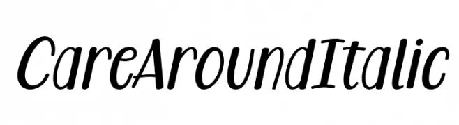
( Fonts by Situjuh Nazara - 7ntypes.com - Personal-use only. For commercial use please contact owner. )
A playful, italic font with smooth curves and a dynamic style.
![Care Around Italic 免费字体下载]() 下载 105 下载@WebFont
下载 105 下载@WebFont


当前最热门的字体有哪些?
设计师偏爱 Astakhov Dished H, Atures 300 PERSONAL USE ONLY, Bellhuy vol 01, Danger Flight Expanded and Templo Extranjero,因为其造型干净、适用范围广—— 从品牌识别到落地页、海报都能胜任。
Logo 最常用哪些字体?
几何 无衬线(如 Poppins、Gotham 风格家族)常用于打造简洁、可扩展的品牌。 想要更亲和,可以考虑 手写体 与手写风格。 用有力量的标题字体搭配中性的正文字体,能兼顾识别度与平衡感。
热门列表多久更新一次?
我们会根据实时下载与互动数据定期刷新。 记得常来看看,抢先发现下一波“爆款”。
💡 小贴士:把本页加入书签——趋势变化很快,今天的热门 可能会启发明天的品牌升级。